The Beale Street Hoopers have donned a number of distinct styles of threads in their almost thirty-year history. From Vancouver, British Columbia, to Memphis, Tennessee, the Griz have featured some of the greatest on-court kits to ever be seen on the hardwood. I discuss below the history of their getups and what I believe to be their best to worst uniforms, whether it be their core jerseys, ABA throwbacks, or city-celebrating ensembles.
#20 Pros ABA Throwback (2005-2006)
 Source: Joe Murphy
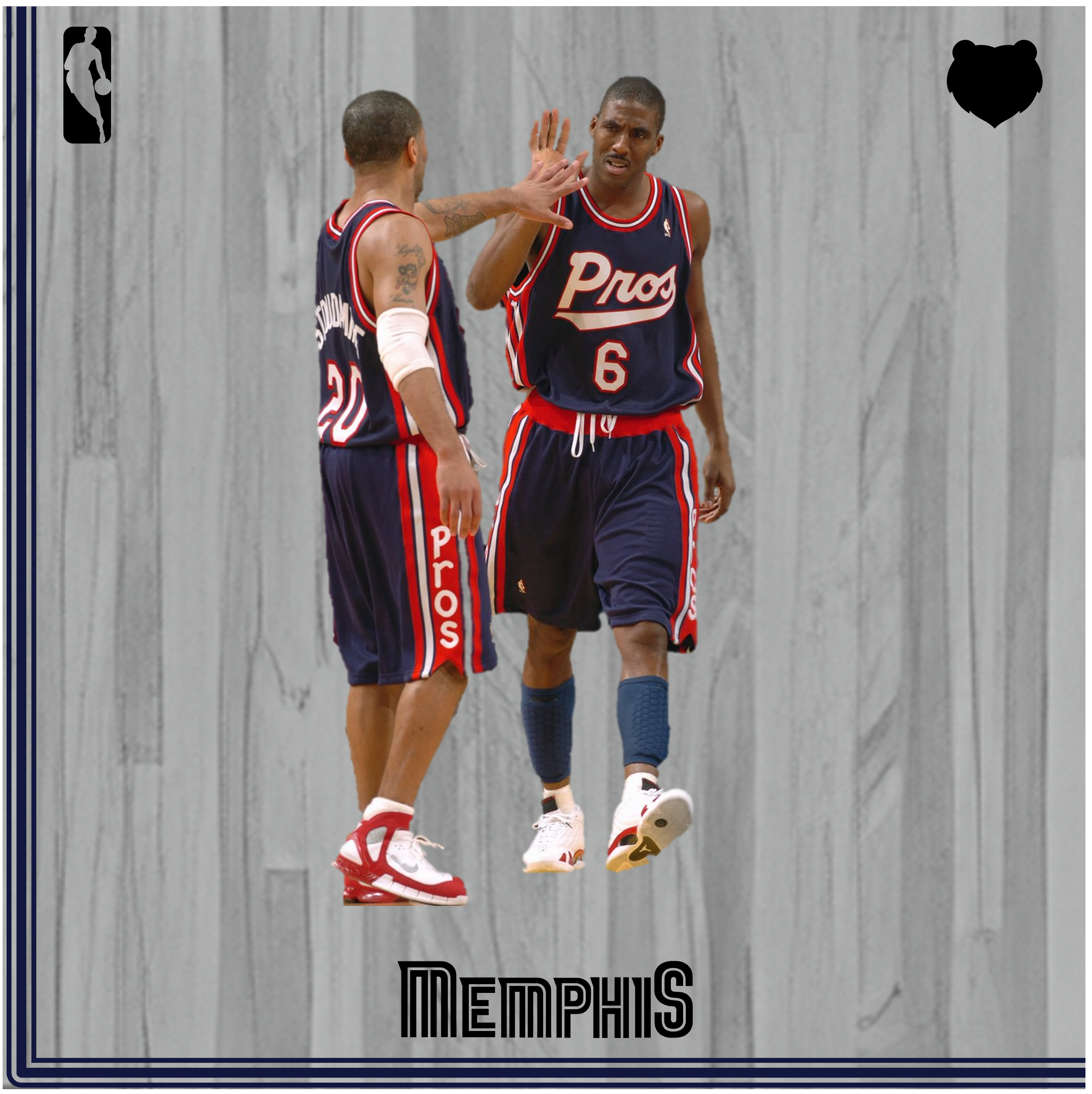
I think it’s worth noting that I have extreme bias towards the entire history of this sacred franchise, so every uniform you see here will be sorted from “good” to “God’s greatest creation.” Let’s begin with “good,” which aptly describes the Pros throwback. In the first of the Griz’ ABA retro series, we have threads commemorating the very first professional basketball team in the Bluff City. Before we begin analyzing the uniform, we must come to appreciate the history of the first professional basketball organization in Southwest Tennessee. The Pros began play in the Mid-South Coliseum on October 20, 1970, but their origin story goes back just a bit, and is one to behold. Mississippi resident P.W. Blake purchased the team from the New Orleans Buccaneers’ ownership group, and when deciding what name they should change to, Blake chose the Pros moniker because of the economic ease with which he could re-sew the word “Pros” onto the pre-existing “Bucs” uniform. While local sportswriters mocked the word choice, it would cost more to find a new four-letter nickname, so the alias stuck.
What a fitting story for the kit that makes the bottom of the list. It’s completely inoffensive, with a navy-and-red color scheme that runs in stark contrast to the typical blues of the bears. The Pros typeface – as sacred as it is – looks like a WordArt selection I drew in computer class on Windows XP back in second grade. I do like the triple piping on the sides of the jersey top, and the vertical “Pros” playful wordmark lining the side of the shorts. It’s a humble and fitting uniform choice that pays homage to the modest beginnings of a franchise that could not get a weekend game in Memphis Tigers’ territory, and with that typical Memphis grit, the original Pros burst onto the scene and took home a respectable 41-43 record their first year in the American Basketball Association. These modest, gritty jerseys aptly represent those humble beginnings.
#19 Association & Icon Edition (2018-Present)
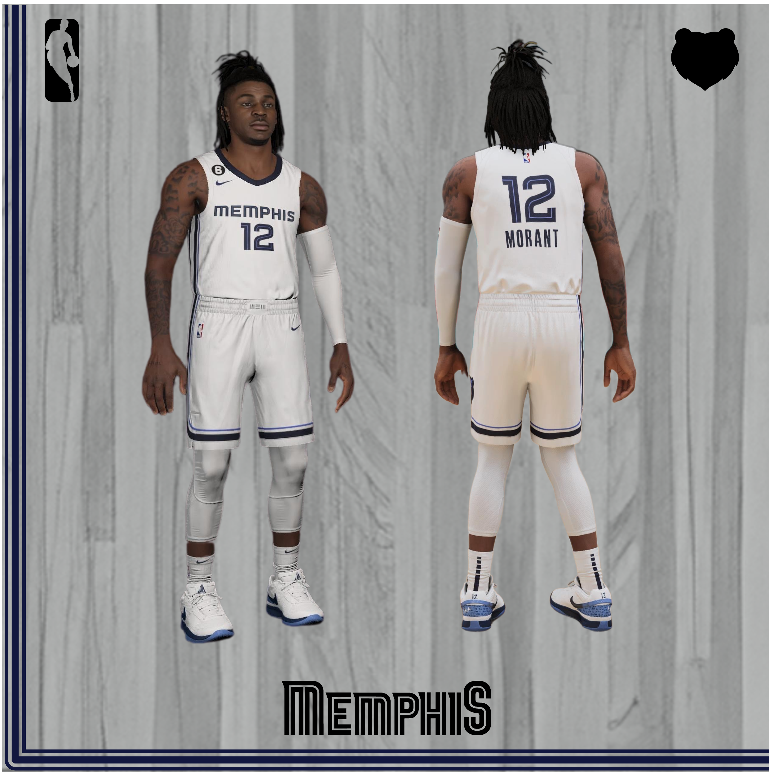
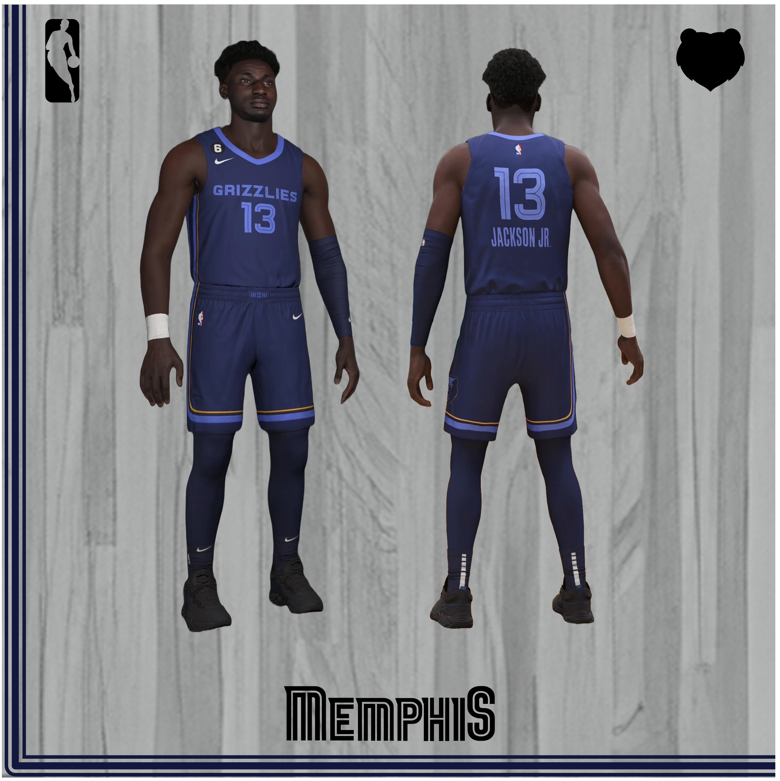
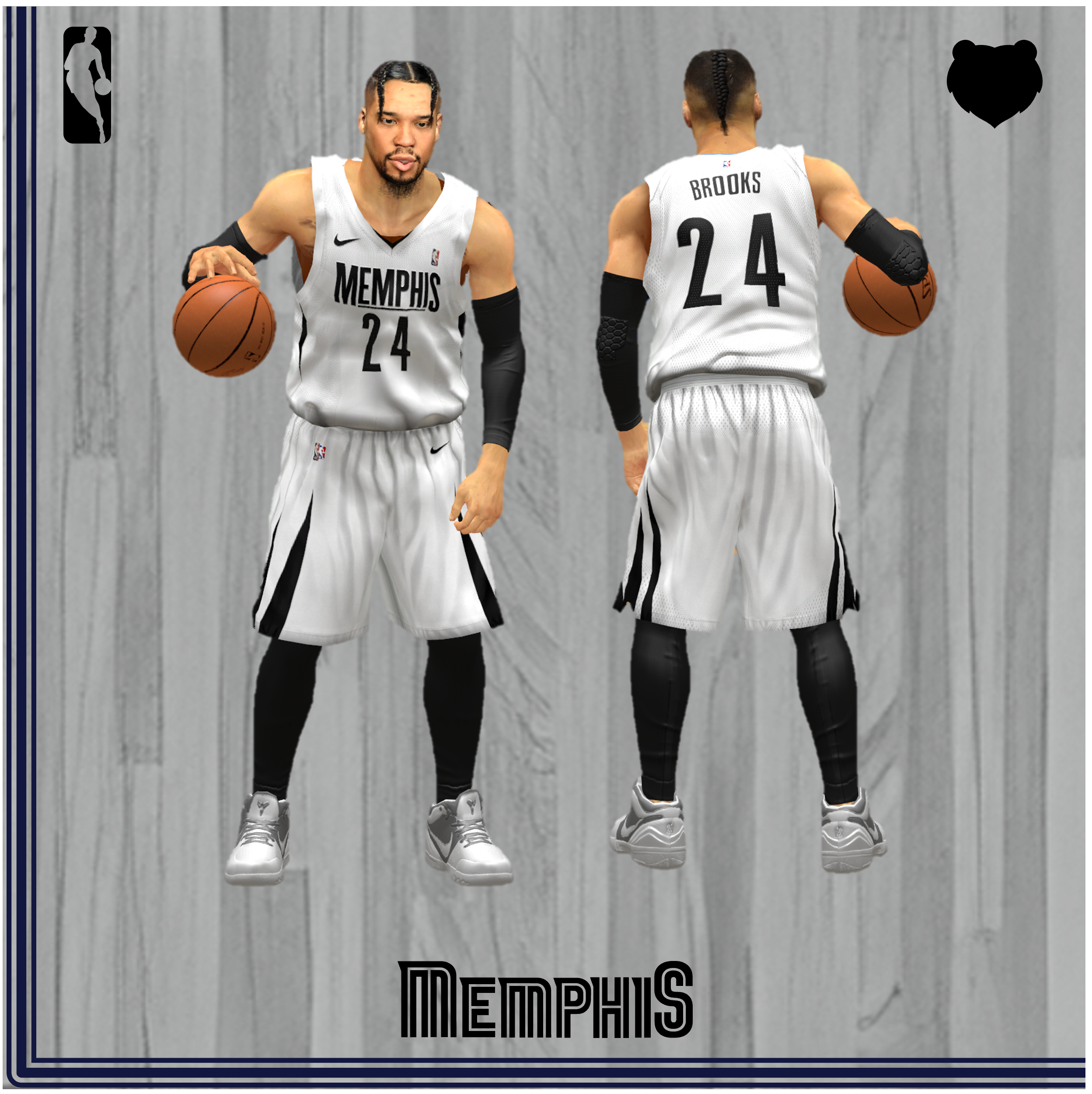
And now we time travel all the way to the modern era. On August 2, 2018, with one year having passed since the big Nike takeover of jerseys, the Griz unveiled their lightly refreshed brand identity. Their core uniforms were streamlined, and now “Memphis” was placed on the chest of their white “Association” edition uniforms, while the “Grizzlies” wordmark landed on their navy “Icon” edition workwear. The asymmetry of the Memphis Midnight Blue line and Beale Street Blue stripe hug the right side of the top and short in their whites, representing the Mississippi River that sits on the West side of downtown Memphis, and in the words of Grizzlies president Jason Wexler, “The asymmetry, the reflection of Memphis as a 4-dimensional city with river, road, rail and runway, the inline of our new wordmark nodding to the neon of Beale Street – all draw from a city that cuts against the grain coalescing into a truly unique NBA identity.” Jason truly found the most Shakespearean way of saying “we put a line on one side of the jersey because our creative lead ate the whole left side of a Kit-Kat before the right and got inspired.” Similarly, though, the Griz carried this stylistic system onto their home court, which has that same asymmetrical line.
While we’re talking about the Grizzlies court and arena, I’d like to take a moment to call out the NBA 2K franchise which has flipped the three tunnels surrounding the court for the players and arena personnel on the vertical axis for the past 19 years. Please @ Ronnie2K on Twitter because my appeals have gone unanswered to fix this travesty. Also now that we’re on the topic of NBA 2K, Ronnie promised me in 2017 that Brevin Knight would be on the All-Time Grizzlies roster, but instead he missed the cutoff in favor of Greg Anthony. Whack. Another fun 2K fact while we’re here: the developers use the FedExForum as a default arena when they lack the rights to an original arena, such as WNBA venues that don’t share with an NBA counterpart (so all teams except Phoenix, Minnesota, New York, etc.) and places that got rushed before production assigned the details were set in place (i.e., T-Mobile Arena in Las Vegas for the In-Season Tournament).
Anyways, back to the jersey rankings: while these kits are undeniably clean, they fall in line a bit too much with the ultramodern practice of cleaning up fun, ornate style choices in favor of brand inoffensiveness that can appeal to the widest audience. These babies were the first to feature a brand-sponsored logo on the left shoulder, though the Griz failed to renegotiate with FedEx after the 2020-21 season (2024 edit: Hello Robinhood!). I do appreciate, however, that the Griz logo was updated to remove the pretty boring Smoke Blue (so long, 3SOB), making the grizzly bear identity just a tad bolder. My favorite feature of these two kits is the “MEM” container stylization on the belt buckle, which is also reflected across the rest of the Grizzlies brand system in the redesign (and later on the ‘23-’24 City’s). I find the navy Icon Edition to be the better of the two, which will be the predominant pattern until the top of this list; that BSB collar is really sleek looking, but for the rest of this uniform’s inoffensiveness, they sit here on my list. Nit: I think the Robinhood logo added in 2024 looks wack on the Icon Edition jersey, as the yellow is not the same as the Grizzlies Gold on the shorts.
Fun Fact: The reason that the light-dark uniform system was in place for home and away games existed until then was based on the early NBA teams’ lack of access to laundering services while on the road, so dark, away jerseys could hide stains before teams got home to clean them.
#18 Statement Edition (2022-Present)
 Source: Screenshot from NBA 2K23
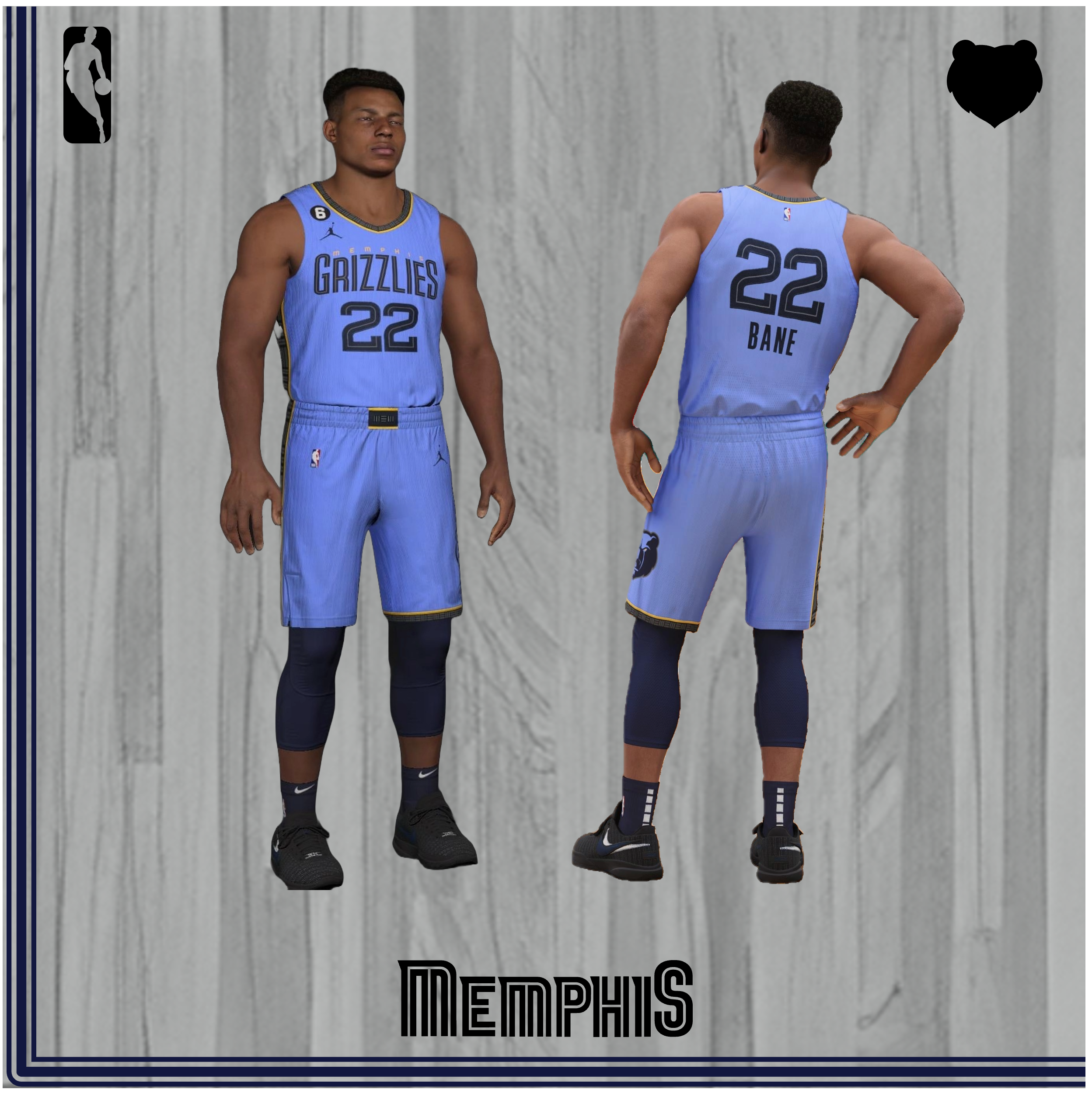
The Griz chose to light refresh their Statement iteration with this kit in 2022. The update was announced cutely with a video where Chief Grind City Media Contributor Lang Whitaker has to tell Jaren that Jitty got the nod as official model of the new jersey over him. And much like going from Jaren to Jitty (who notably had a very forgettable 2022-23 season), this jersey change was a downgrade. We’ll get to the original Statement Edition lower in this list, but the key change was adding in the asymmetrical design system along with the shipping container alternate logo in between yellow lines on the side and belt buckle, which first appeared on the ‘21 City Edition “Soul” side panels. But beyond that inoffensive change, I really dislike the unnecessary, barely legible, slightly arched Memphis wordmark sitting atop the Grizzlies design that resembles the Knicks skyscraper logotype. The old Grizzlies arched lettering was boring, but I felt like it was a natural evolution from the pre-rebrand GNG-era BSB uniforms. They certainly have a bit more going on than the pre-2022 Statement Editions, but I think it made sense to have a jersey without the asymmetrical side-lining that showed off the best color in sports.
#17 City Edition “Hometown Feels” (2023-2024)
 Source: Screenshots from NBA 2K24
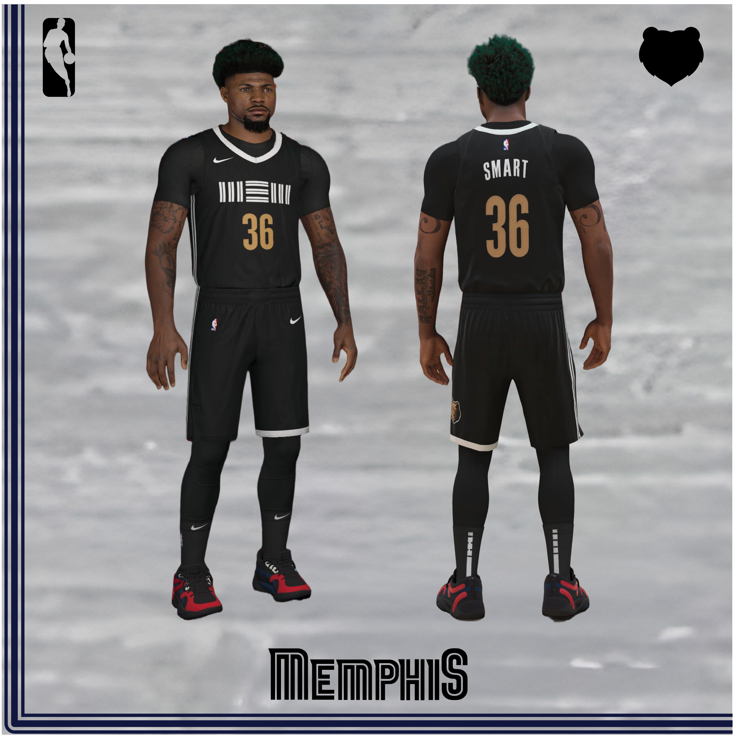
Sometimes, you just gotta play it safe. Get rid of that barking Mississaugan, that expensive backup point guard, but keep hanging onto that injury-prone screen setter for just a little longer. And for your seasonal City design, throw an all-black jersey together with a dash of gold, guaranteeing yourself the best minimalist outfit in an already oversaturated group. While I can appreciate the cleanliness and consistency in these midnight getups, they just don’t fall in line with the brilliance I can usually expect from the hometown design team. Another major penalty here is the fact that these jerseys were worn in the midst of an entirely forgettable campaign; contrast these to the “GRZNXTGEN” City Editions legacy of twice yesteryear – a jersey in which Ja’s third-quarter immortal playoff dunk over Malik Beasley was worn – 12 wore these just once, in a loss to the Raptors. I do, however, appreciate the jersey’s theme of playground parks, and the accompanying blacktop-style court that makes it look as though the Griz are partaking in the city’s love of concrete basketball.
In a way, these jerseys were inevitable; I feel as though the Grizzlies’ airport-code “MEM” neon-like logo did not deserve its own design, but it’s no surprise they pulled the trigger on making this jersey happen in a second-straight non-anniversary year (which occurs every 5 years, once for the franchise forming in 1995 and another for the move to Memphis in 2001; do the math, or preferably, just trust me). Pulling the gold numbering from the past City Editions (‘21’s “Soul” and ‘23’s “Big Memphis”) is a nice touch, but also pretty unremarkable. Keeping the split-line lettering and side panel trim consistent is also a wise way to maintain minimalism, and mediocrity. The gold bear on the shorts is the perfect encapsulation of this uniform: a nice accent of the Griz’ typical visual nomenclature, but rather undeserving of its own time in the sun.
#16 Memphis Home & Away (2004-2018)
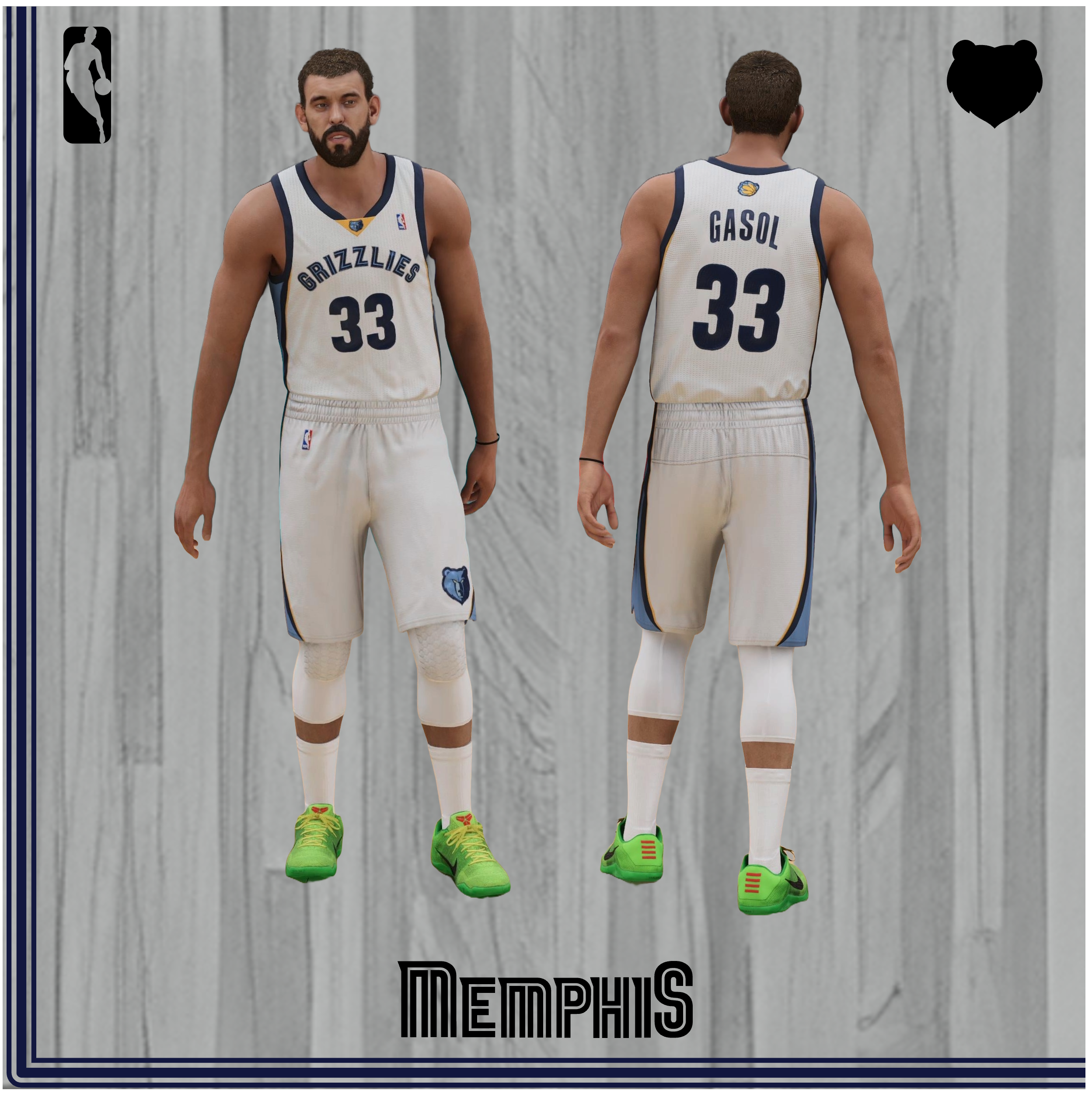
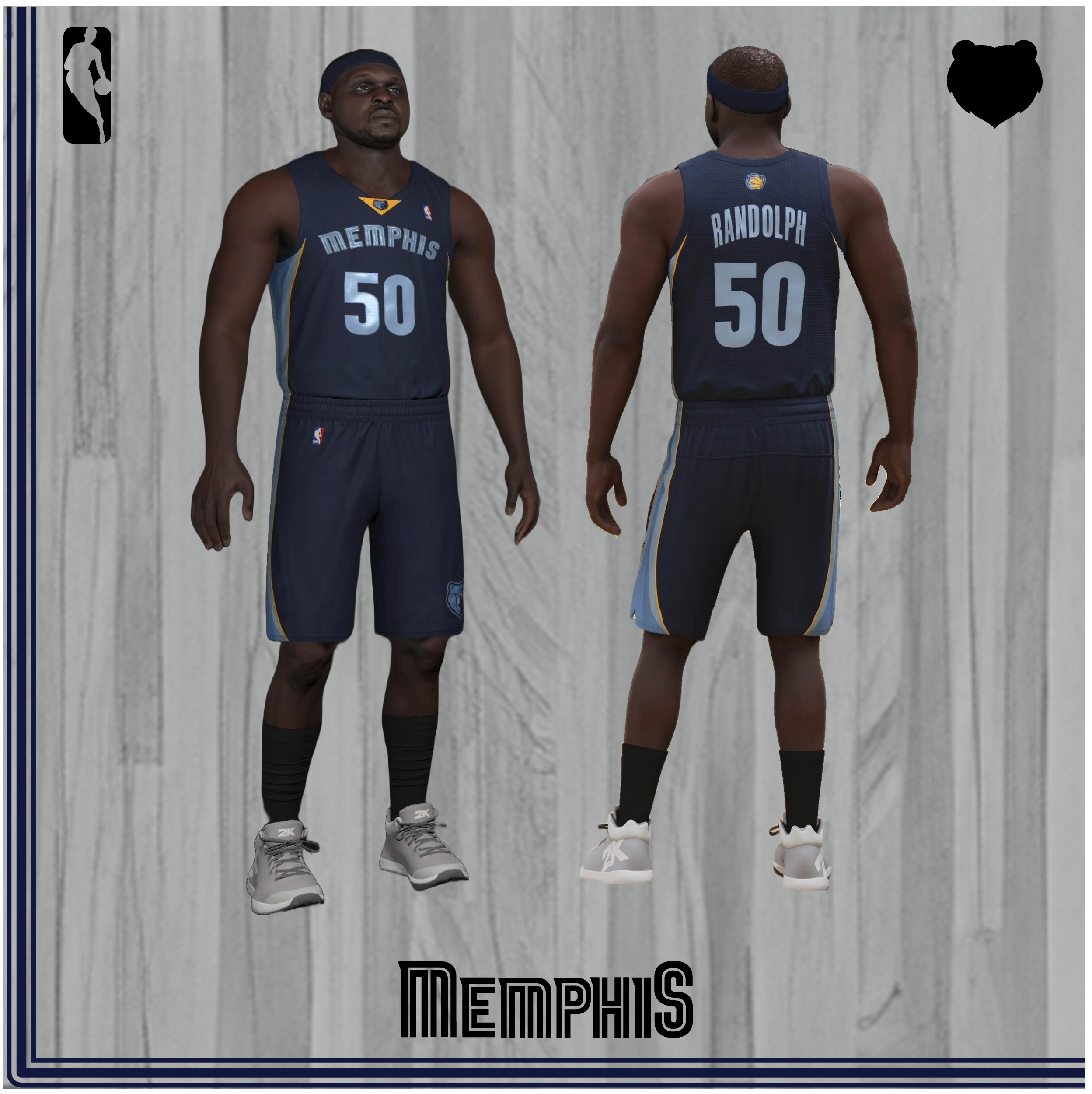
Although the Griz were probably sad to move out of the seventh largest pyramid in the world, their logo was updated to portray ferocity and strength, according to former Grizzlies President of Basketball Operations Jerry West, who could have utilized that tenacity to bring Kobe Bryant to the Bluff City, you coward. On May 24, 2004, the Griz unveiled their famous three shades of blue. These jerseys lasted for an impressive fourteen years, with only minor changes altering them during their lifespan. These guys are classics, and they’re ranked above the new ones because of their strong patterns incorporating the Griz Gold, Memphis Midnight Blue and Beale Street Blue on their trims going down to the shorts. The arched lettering with the BSB frame and MMB outline has always seemed a timeless classic to me. On the away navies, I appreciate the MMB collar blending in with the main texture, and as before, I prefer the navies over the whites. There’s not much else to remark about these: they’re classics without the modern bells and whistles. With so many other great jerseys in franchise history, this pair sits here towards the bottom of the list.
Fun Fact: These jerseys were updated in 2010 to remove the BSB lining within and increase the size of the numbers, and with the Nike takeover in 2017, the gold collar containing the logo was removed, with both changes happening to the home whites and away navies. The bear logo also moved under Nike’s rule in 2017, shifting to a smaller version centered on the waist.
#15 City Edition “Main Event” (2018-2019)
 Source: Screenshots from NBA 2K14 / Custom Replica by Pep
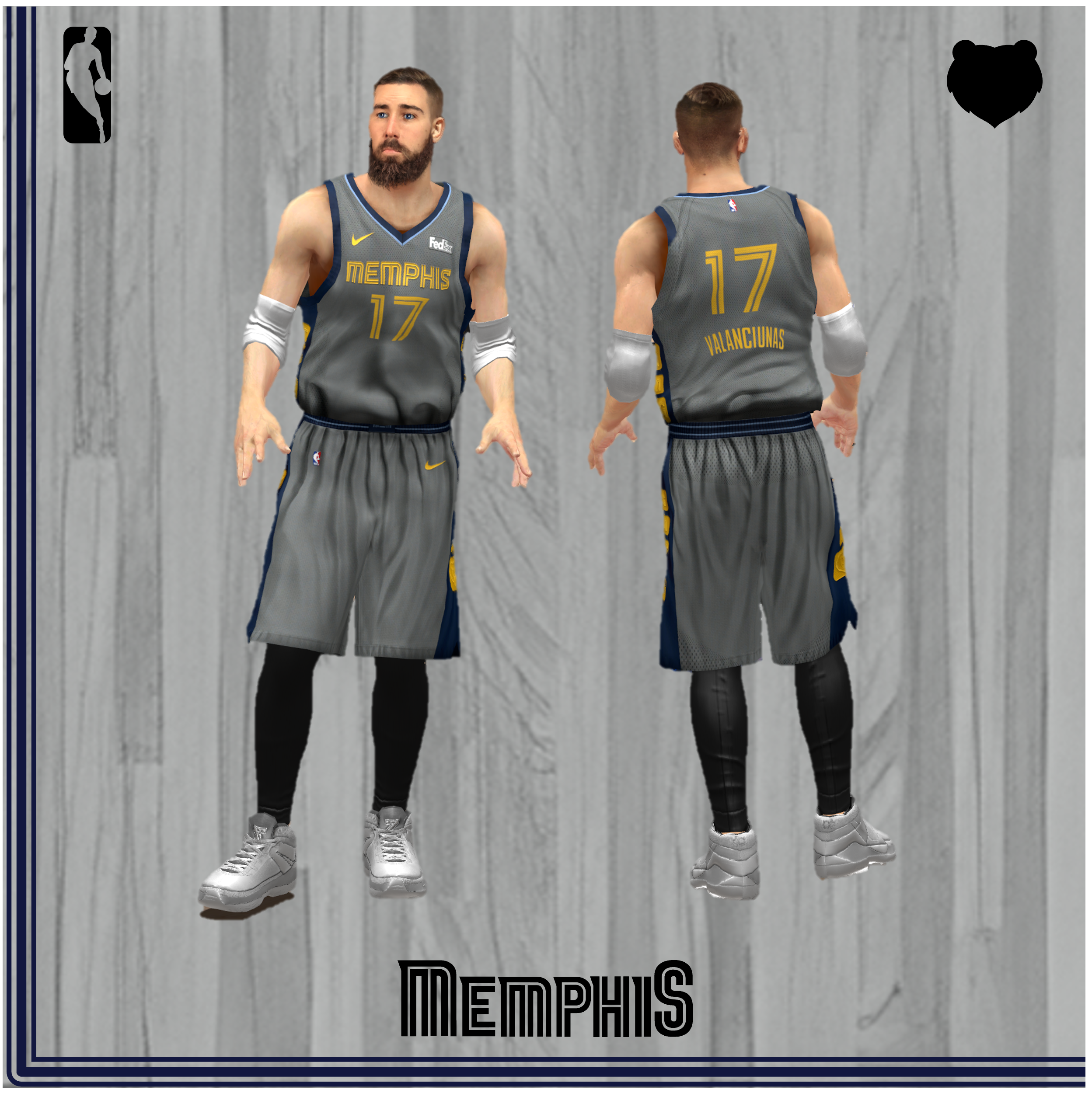
Every city edition that the Griz have put out is a banger. The Mane Event jerseys are no different, but they’re certainly the weakest of the bunch. The second City Edition uniform under the new Nike management celebrates the history of wrestling in the Bluff City. The highlight of these gray getups is the side pattern featuring golden belt-like links with the letters “GNG” covering three separate squares, augmented by the main logo in the fourth, larger spot. This is a brilliant concept to merge the culture of wrestling with the “Grit-n-Grind” attitude of the exiting Grizzlies core-four. However, relegating this design system to the jersey’s edge sidelined its main thesis. Additionally, the brand identity came at an awkward time, as Marc Gasol was traded midway through the season, and Tony Allen, the heart of GNG, had left a year prior. Like the old Griz jerseys, they feature a navy inlay for the gold letters and numbers. I do like how seamlessly the FedEx logo blended in here, as they opted for a white-only patch to sit against the background Steel Gray; however, it would have been a better fit to match the rest of the wordmarks and symbols by using that same gold color. The BSB collar outline is unique and cute, but doesn’t add a whole lot to the conversation. These might be the best gray uniforms in NBA history, but unfortunately, the bar’s not that high.
Fun Fact: I use an example picture of JaMychal because I saw him on a date once at the brand new Main Event off of I-40. (…Get it? We have fun here.)
#14 Memphis Tams ABA Throwback (2011-2012)
 Source: Screenshots from NBA 2K16
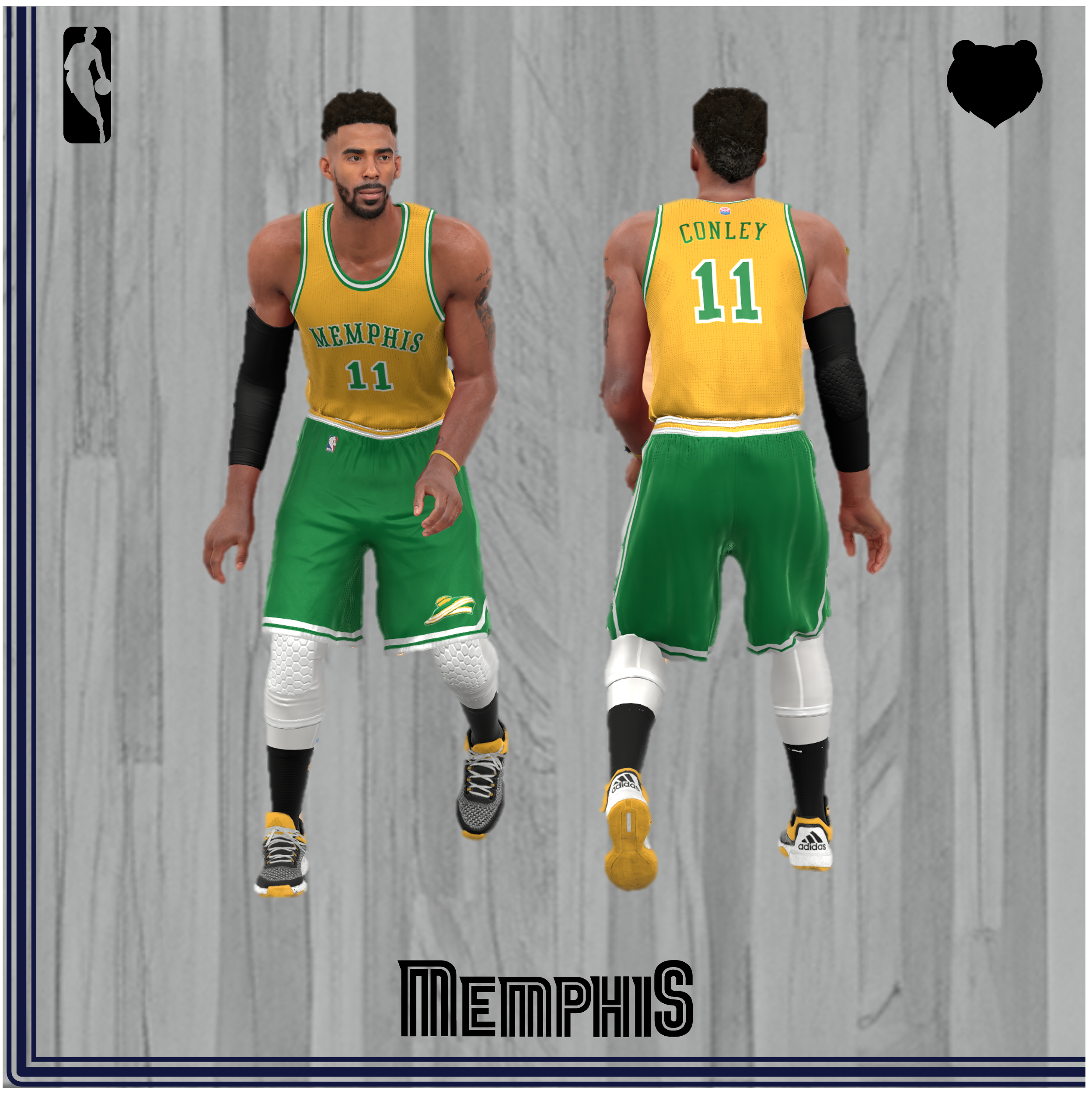
While a certain Taiwanese Harvard grad was captivating the attention of the Atlantic Seaboard, the Grizzlies captured the heart of the Midwest, as they debuted one of the boldest design choices in the NBA’s – and maybe even the ABA’s – history. The Tams jersey is a quintessential relic of the 1970s: bizarre, vibrant colors with exaggerated serifs on a varsity-style font. The timing of the uniform also coincided to celebrate a 1970s Memphis legend, Gene Bartow, with a patch on the right shoulder, as Bartow had just passed from stomach cancer.
But back to history class: the Pros struggle mightily in Memphis, but not without some positive fan experiences. With financial issues back in the forefront (a staple of ABA ball), Pros fans united to fund just south of the $800K asking price to keep the team in Memphis, with fans buying stock in the team in what some have referred to as the “Memphis Miracle” (they hadn’t met first overtime Greivis Vásquez yet, to their defense). Their new ownership structure clearly had some holes, since the chief stock buyer ($25K) had the authority to conduct trades without consulting the head coach. Eventually, the team’s play (and financial situation, given that the ABA repossessed management of the team) suffered as well, and Oakland A’s owner Charles Finley stepped in to buy the team. The fans were called upon to vote on a new team name, and given that Memphis fans comprised the Tennessee city along with their Arkansas and Mississippi neighbors, the “TAM” acronym was assembled by fan and West Point, Mississippi native William B. Barrett and the team became the Tams. Finley decided to use the A’s color scheme in the most controversial uniform choice in Memphis history, as a “Tam O’ Shanter” hat also bore those same colors and became the team logo, placed on the left leg of the shorts.
The design is pretty straightforward, with the most unique aspect being the mismatched shorts and tops. Bonus points are awarded for the ABA logo sitting above the player names on the back. Though I am a fan, some might side with Commercial Appeal writer-in John Allen who had this to say after a bad loss to the Jazz on national TV: “Burn the hideous Tams uniforms.”
#13 Memphis Home & Away (2001-2004)
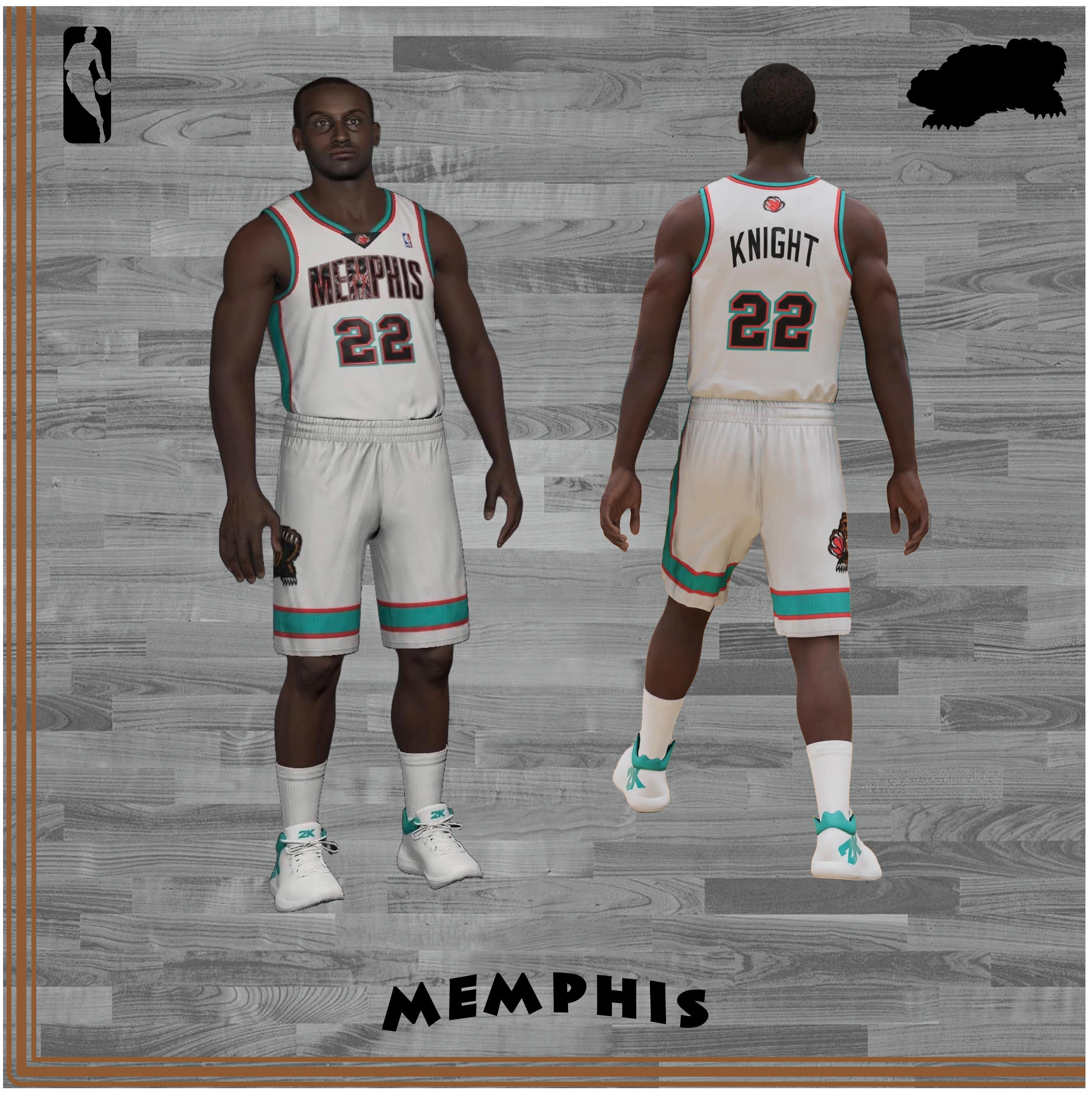
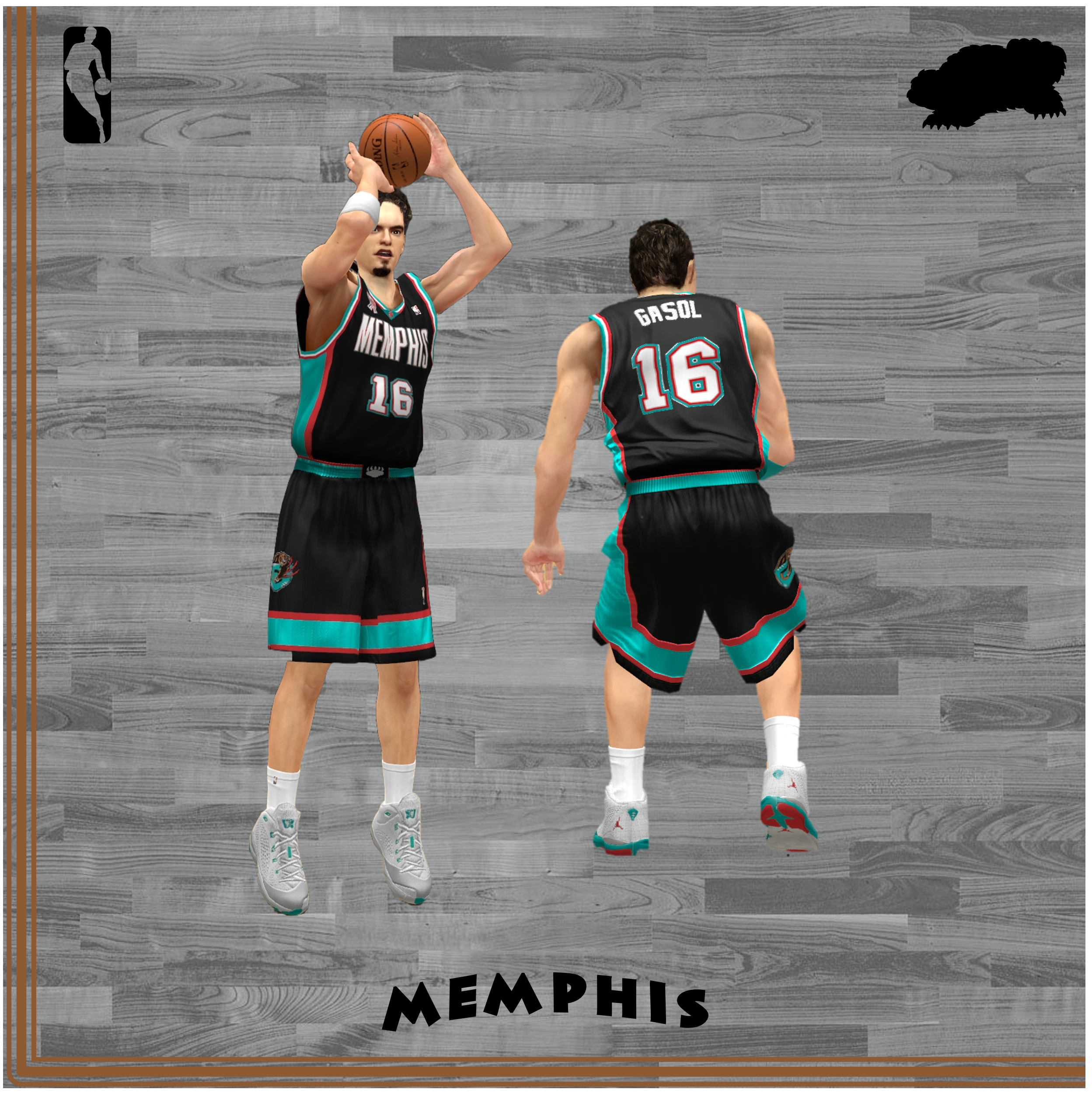
I’ll leave the in-depth review of these getups to the slightly better Vancouver unis below in the hopes of keeping down this quickly burgeoning word count. But I will say that these borrowed uniforms are wonderful, but not quite as wonderful as their immediate predecessors. While the home jersey’s only change was a wordmark change from “Grizzlies” to “Memphis” (a wise adjustment to remind viewers watching on television that the Grizzlies were in Memphis now), I vastly prefer the Vancouver wordmark on the away uniform’s chest. The word Memphis written in uppercase has no vertical diversity, with the jersey designed to have a perfectly curved arch traced on the top and bottom of the wordmark (save for the right side of the letter “P”). Vancouver, on the other hand, has two striking “V”s with sharpness that underscores the theme of a grizzly bear. Alas, it’s a minor change and not worth delving into deeper.
Fun Fact: The Griz simplified the waistline and shorts in 2002 by removing the pattern and replacing the G-bear logo with the bear claw emblem. I prefer the originals.
#12 City Edition “Memphis Soul” (2020-2021)
 Source: Screenshots from NBA 2K21
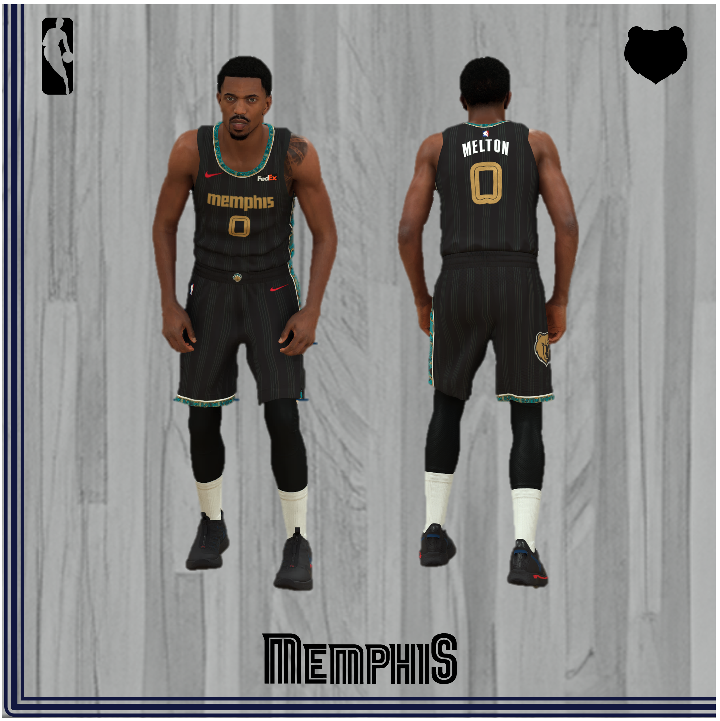
The Griz tapped into their melodic bag for the City Edition in 2020 with inspiration taken from the decorated Twentieth Century music scene surrounding Stax Records and its star composer, singer, pianist, and Memphis-native Isaac Hayes. The design team rolled with the Grizzlies’ now standard asymmetric style and gold detailing, reminiscent of the stacks of gold records earned by the aforementioned entities. The alternating vertical stripes represent the grooves in a vinyl record, and the “MG” pattern on the wearer’s neckband and left side along the shirt and shorts is ornately decorated with inspiration taken from African Kente cloth. In my favorite detail, the pattern is modeled gold and turquoise after Hayes’ 1972 Cadillac El Dorado, today parked inside the Stax Museum. Two final easter eggs are Hayes’ golden sunglasses hidden on the right short vent–directly below the Grizzlies gold logo–and the Stax logo, of which the lowercase “Memphis” wordmark is stylized after, concealed right under the left short vent adjacent the vertical “MG” pattern. Finally, the Griz claw is stamped right at belt center, red Nike logos coolly deboss the jersey and short, Isaac Hayes’ full name is printed above the jersey tag, and the FedEx logo in its native white and orange coloring occupies the designated sponsor spot. I must comment on that last detail; the logo appears wholly out of place and feels like it was forced to stand out with that same, unique Nike red to remind fans that FedEx paid lots to put their name there. While I must admire the artistic accomplishment that is this uniform, I admit that this uniform leaves something to be desired. The design is masterfully crafted and does a wonderful job at celebrating a milestone character in the city’s history, and the uniform’s “MG” pattern is among the best neck and side designs in franchise history. But I feel that the dominating black grooves play pretty weakly, and the gold wordmark and jersey number, though pretty, do not stand out. Perhaps if the dominance of the cloth and groove designs were to invert, with the uniform instead showcasing the turquoise and gold Kente cloth pattern much more prominently, this getup could really pop. But that’s left as an exercise to the team designers for a future jersey. After all, Isaac Hayes also played a major role in purchasing the Memphis’ Tams off struggling businessman Charles Finley (stay tuned for the third chapter of that story), so a follow-up City Edition extending the celebration of our city’s music scene should certainly be an option on the table.
#11 Vancouver Home & Away (2000-2001)
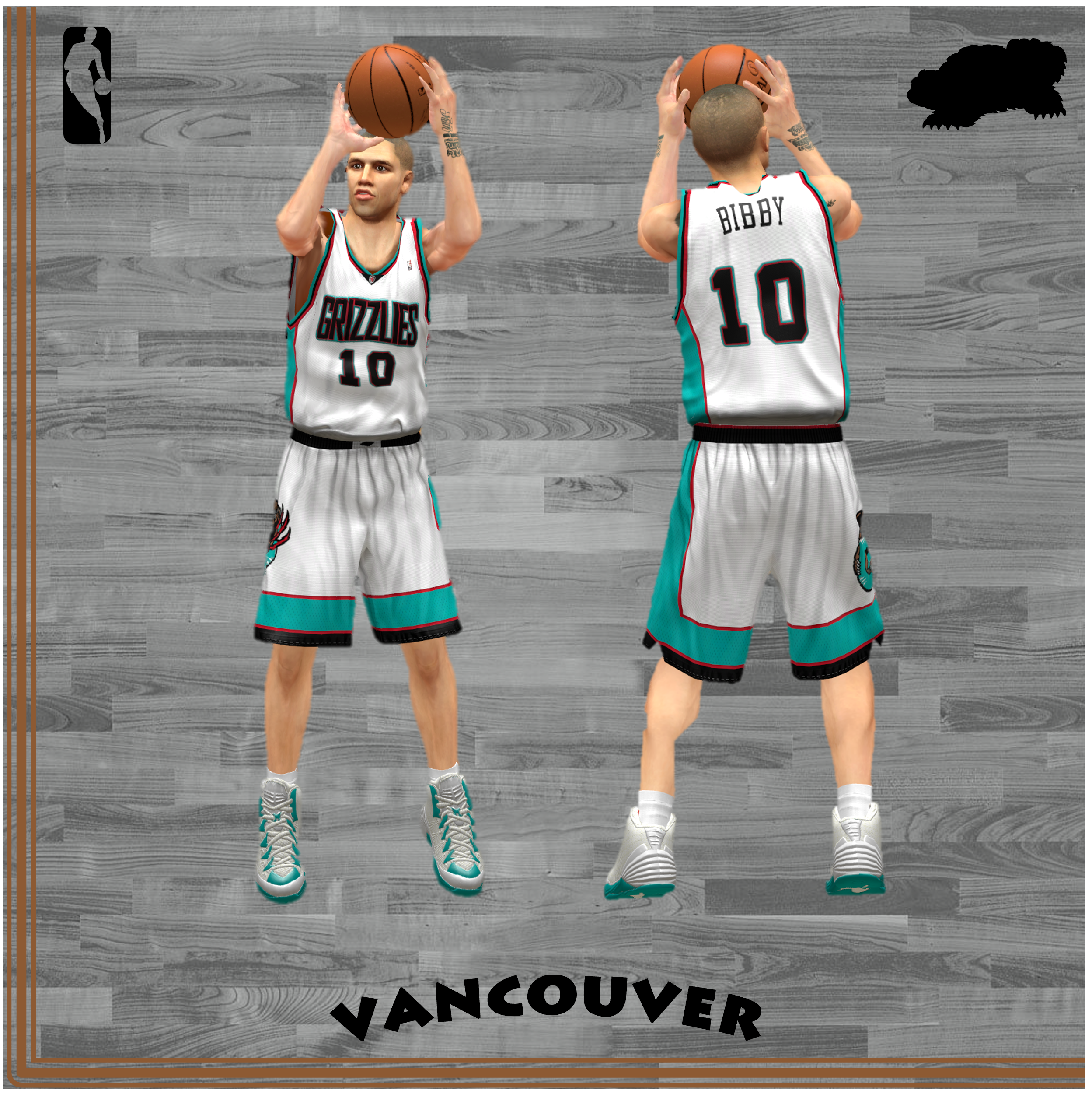
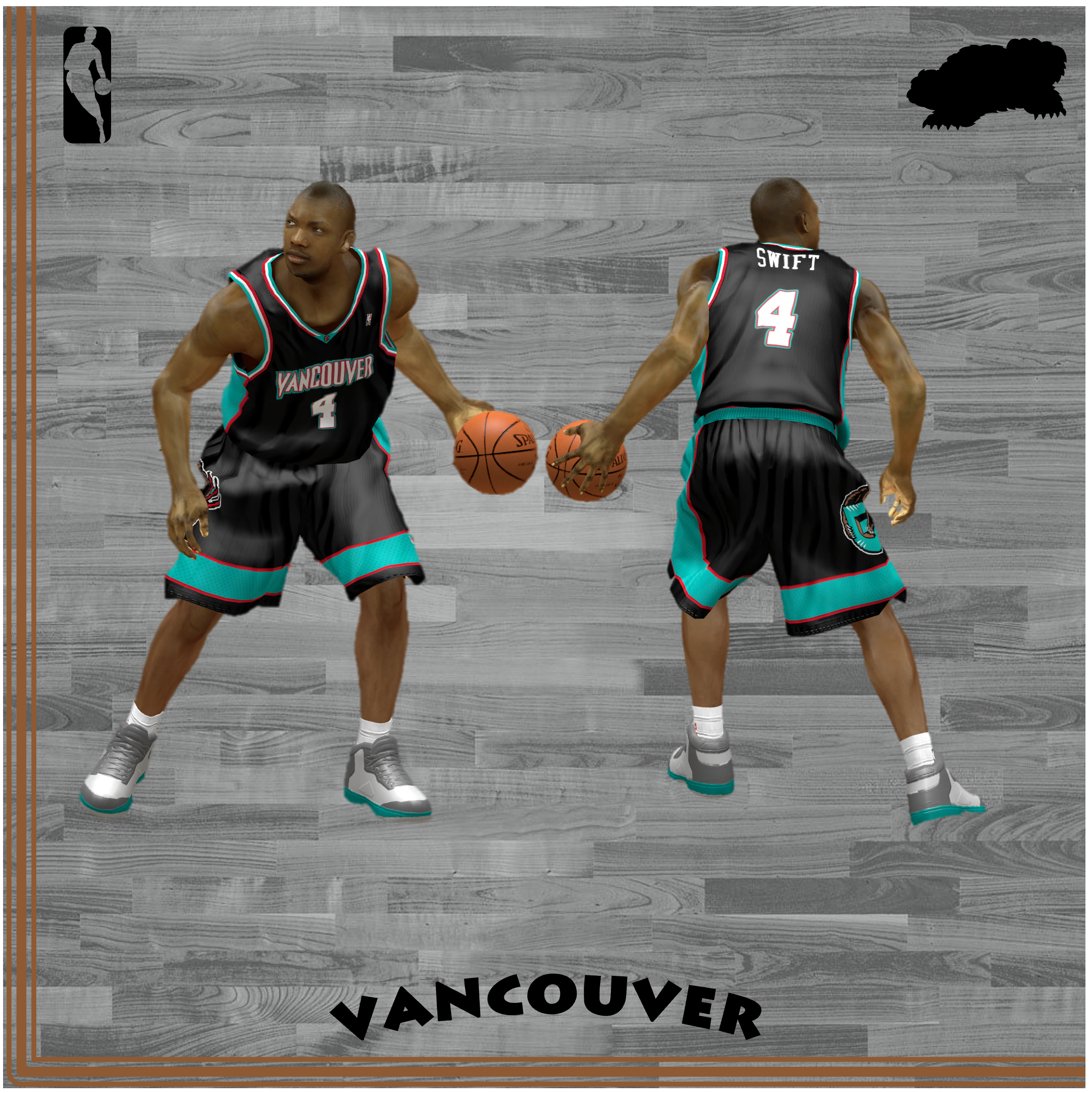
Black, red, and turquoise. The colors you would expect to find in those new 3D glasses at the movie theater were perfectly incorporated into the Grizzlies home-and-aways in their final season in Vancouver. The red stripe surrounding the thick turquoise block on the sides and on the belt is super clean, and the pure-black claw on the buckle is a cool minimalistic touch that reminds you of the danger of the grizzly bear. The away blacks were actually the first alternate in franchise history, as they were introduced in 1997 before securing the main gig in 2000. The home kit is a nice look, and I love the black triangle under the neck with the fully-colored Griz claw secondary logo inside, but the black stripe on the belt instead of the turquoise is a rare miss in the home jersey. But the away uniform is absolutely perfect: the design, the black combined with the red and turquoise, the G-Bear leading to asymmetry with the stripe pattern only on the left leg (the first time in franchise history where asymmetry plays a major role), the way the belt block seamlessly blends together the black in this jersey. The only improvement I would make is removing the horizontal stripe pattern from the shorts cutoffs to more fully lean into the darkness. But the best part of the jersey, and why I consider the away jersey to be significantly fiercer than the home edition, is the sharp lettering of the double V’s in “Vancouver.” The red and turquoise is super apparent in the wordmark and pop brilliantly, and the V’s (and trailing R) have such an intense quality that were absent later on in the Memphis wordmark. Vancouver is such a cool city name, and you really fear the bear when you get the claws in the jersey’s belt and the teeth on its chest.
Fun Fact: The minimalist claw on the belt was colored Grizzlies bronze instead of white when the away jersey was still an alternate from 1997-2000. I just barely prefer the white.
#10 MLK50 Pride (2016-2017)
 Source: Screenshots from NBA 2K14 / Custom Replica by JR15
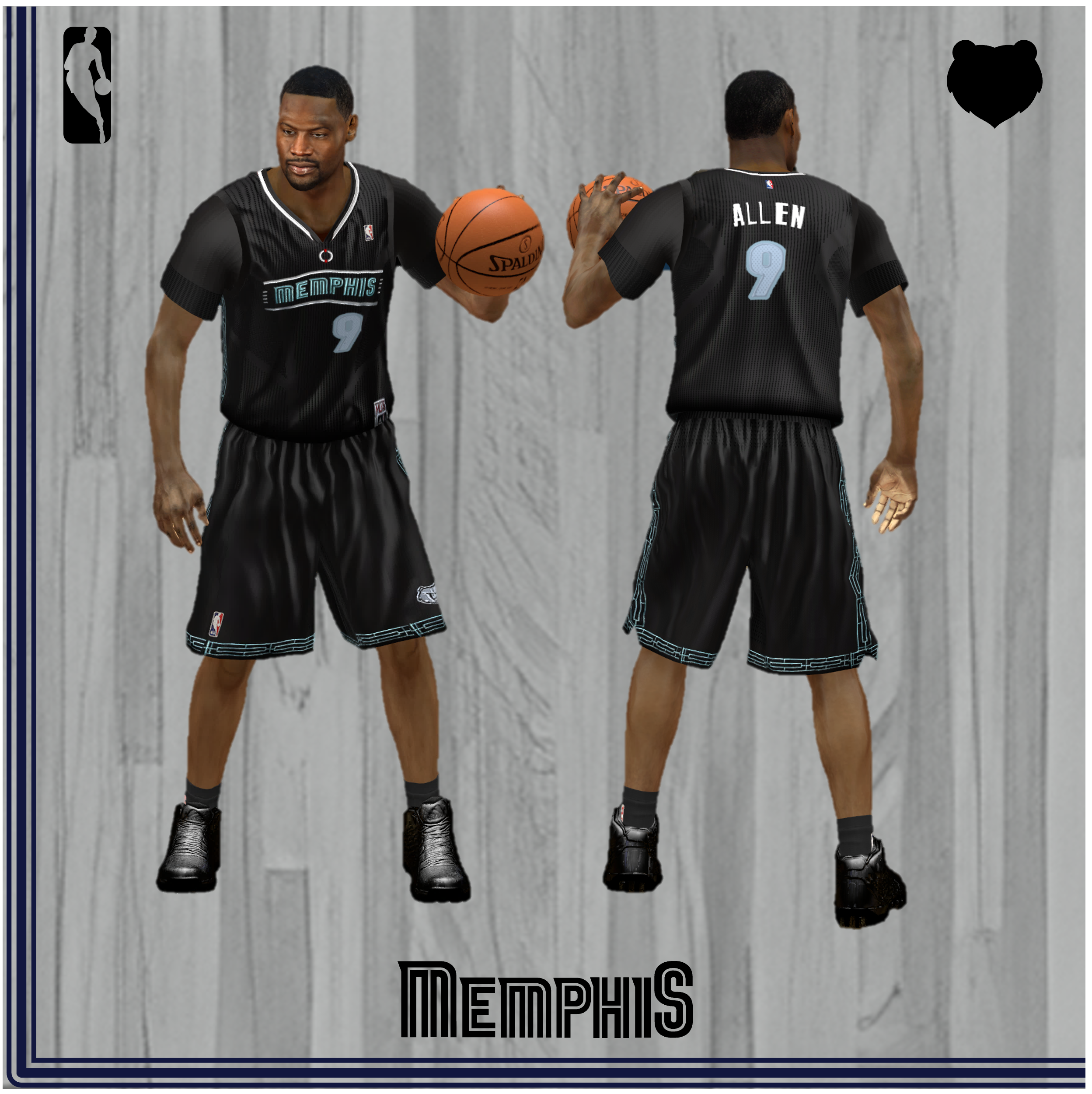
Our Grizzlies chose to honor Martin Luther King Jr. on the 50th Anniversary of his assassination, in their first (and coincidentally, last) attempt at a sleeved uniform. Their jersey honored Dr. King by evoking the Lorraine Motel’s historic design components, the site on Mulberry Street where MLK was killed. The base is a subdued black, accented by a gentle, sea foam “MEMPHIS” wordmark and a piping design flanking the shorts. The typeface utilizes the Griz’ typical font with a serif touch on each letter; it’s framed with two lines above and below, with short dashes on either side. Though many sources I’ve found state that the wordmark utilizes the Lorraine Motel’s unique lettering, it’s far closer to the Grizzlies primary script. However, the framing of the wordmark within a rectangle is reminiscent of wording with the marquee on the motel’s south side. At the base of the neck is a white-and-red wreath, which today hangs on the balcony next to rooms 306 and 307, where Dr. King was shot. The piping on the shorts cleverly employs the balcony’s railing design, and is tinged with that same sea foam color. It’s fitting that the last jersey of the Adidas era is a sleeved one, as players were vocal in voicing their distaste for the fashion choice. This jersey makes no offensive decisions, and is tasteful with its commemorative respects. I do find the choice to honor MLK with basketball workwear that highlights the spot of his assassination a bit discordant, though its connections to the city are undeniable. Though it is appropriate that this jersey comes right before the next season’s first City Edition “I Am a Man” one, paying respects to a revered individual in our town’s history before coming out strong with a celebration of the Memphis Sanitation Workers’ Strike. The jersey’s discerning design was well-suited for the Grizzlies aging GnG era, and has enough artistic integrity and ease on the eyes to earn it this spot on the list.
#9 Statement Edition (2018-2022)
 Source: Screenshots from NBA 2K22
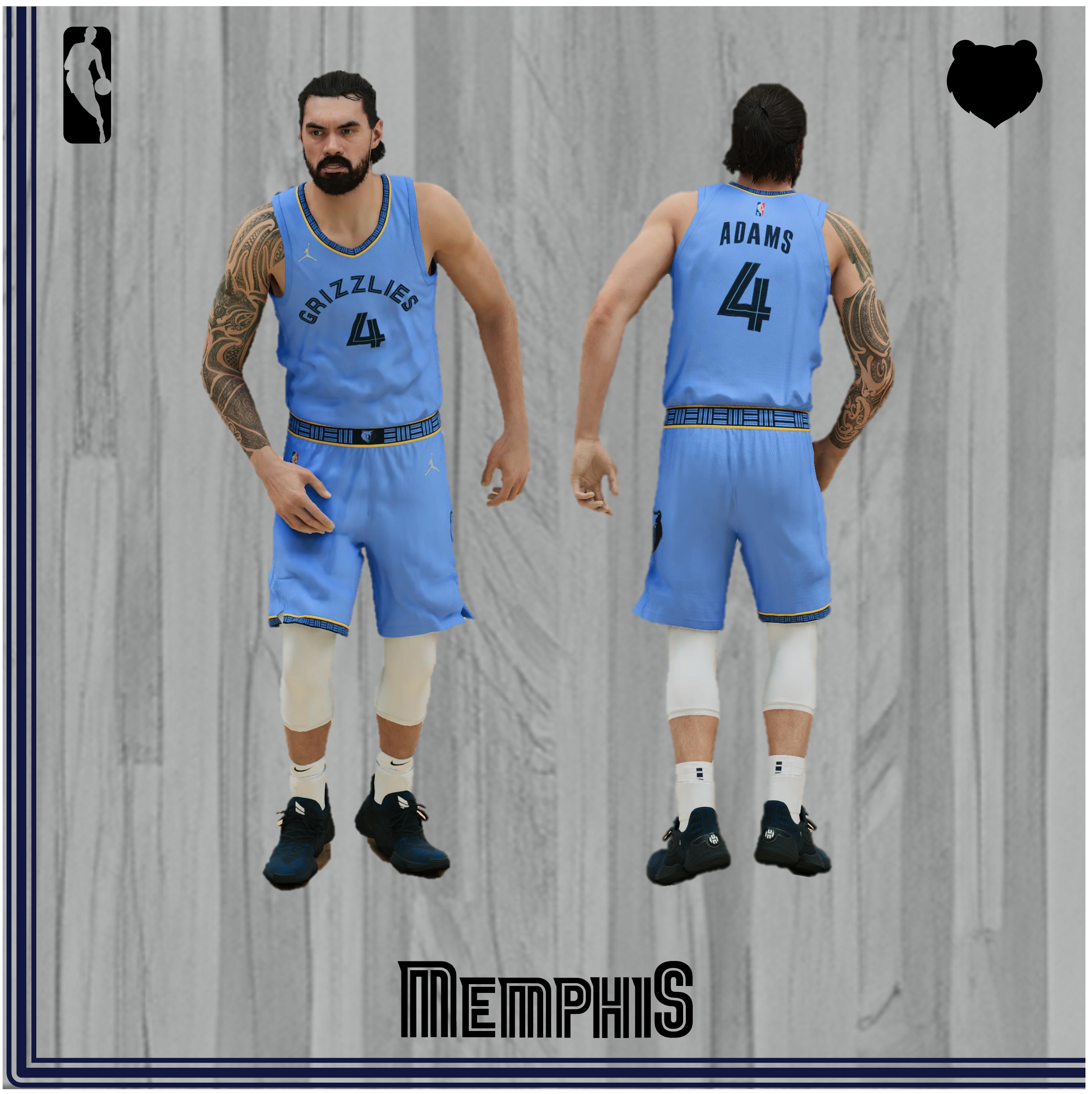
The Griz’ first alternate in the Nike rebrand era simplifies their previous baby blue alternate (which we’ll get to soon), keeps most of the color identity, and uses a simple “Grizzlies” wordmark arched on the chest above the typical navy number font. At the neck, belt and the right short’s cuff level, the “MEM” container style spreads horizontally in BSB above an MMB background, save a space for the Griz logo at the center of the waist, with a trim of Grizzlies Gold separating the pattern from the uniform foreground. Unlike the core jerseys, there are no lines asymmetrically adorning one side of the tops and bottoms. The jersey is also the first to employ the Jordan “Jumpman” logo as a manufacturer’s stamp. All in all, these guys are clean and effective. There’s a slight regression in brand identity compared to the previous alternates (it’s on this list soon, I promise), but it still represents the Griz well. It’s simple, straightforward, and stylish, but the Grizzlies rebrand, much like for the core editions, weakens the delivery in favor of minimalism. Though branded the Statement Edition, the design feels more like a weakly spoken Comment.
#8 Europe Live Tour (October 11, 2007)
 Source: Screenshots from NBA 2K14 / Custom Replica by Pep
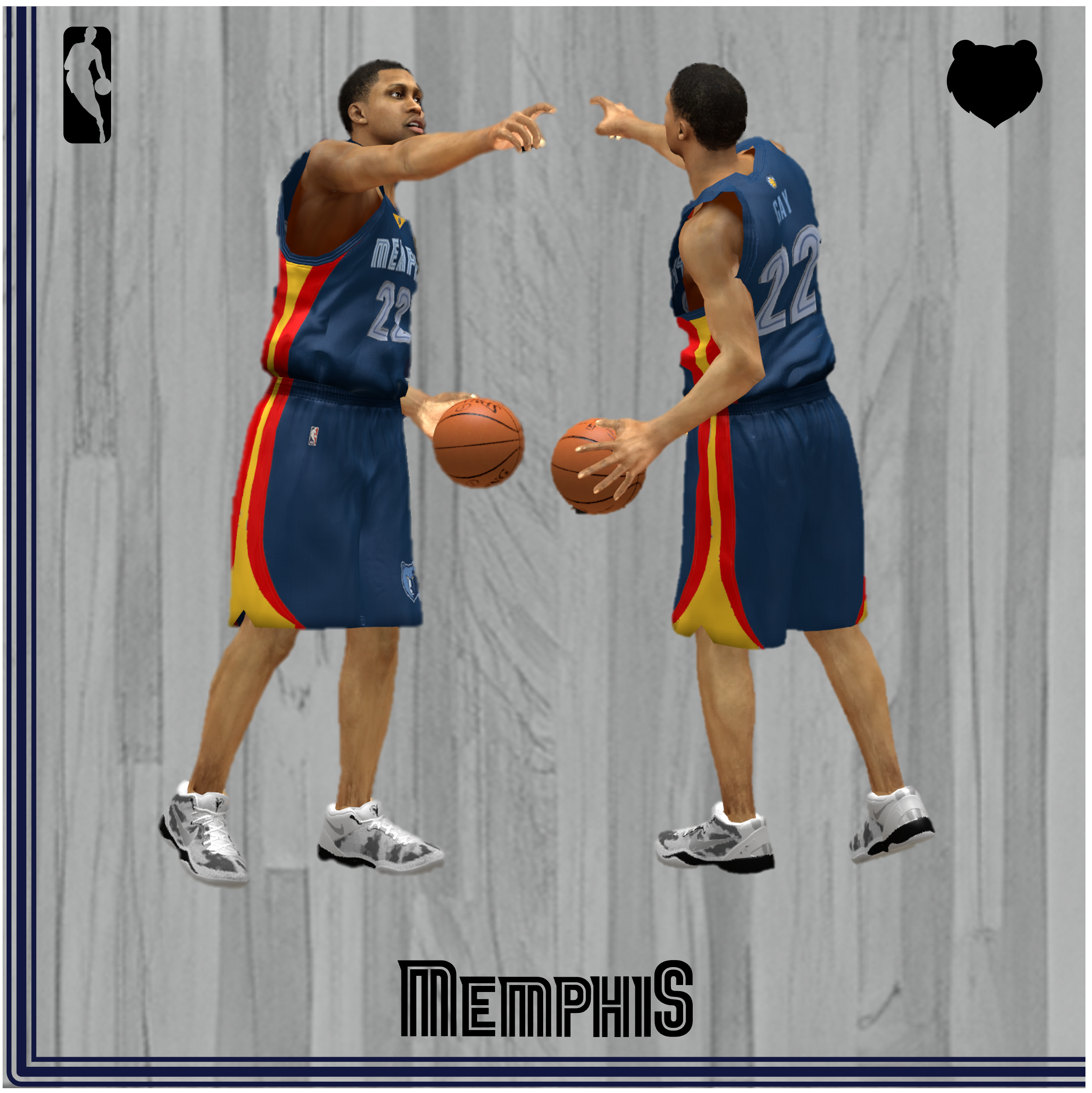
The EA Sports Europe Live Tour in October of 2007 featured some real unique themes never before experimented with on NBA jerseys. Although I had seen this jersey before, I never understood the meaning of its extracurricular design. It took me finding a bootleg copy of the Grizzlies vs. Spain’s ACB-participating Estudiantes in Madrid to put it together: the kit’s side incorporated the tricolored Spanish flag, with red on either side of the interior yellow. The core of the jersey is just the typical, three-year-old away uniform with the Memphis wordmark arched. The Grizzlies Euro design is the safest bet among the nine jerseys used in the Europe Live Tours spanning 2006 and 2007: more creative designs include Boston using Italy’s colors within their wordmark on the chest, and the Clippers using Russia’s flag in a checkmarked pattern on either side. To ensure my knowledge of that two-hour game did not go to waste, I should let you know that the Griz overpowered Estudiantes easily despite weak performances from Mike Miller and Rudy Gay, mostly because they felt embarrassed by their loss two nights prior to Unicaja Málaga (a game in which they wore their typical home whites). Also notable about this game was newcomer-slash-Spanish native-slash-Pau’s friend Juan Carlos Navarro getting a major standing ovation from the Spanish crowd. This jersey is nowhere near groundbreaking, but its high rarity score and celebration of the most important nationality in Griz history nets it here on the list.
#7 City Edition “Big Memphis” (2022-2023)
 Sources: Screenshots from NBA 2K23
Who run it?
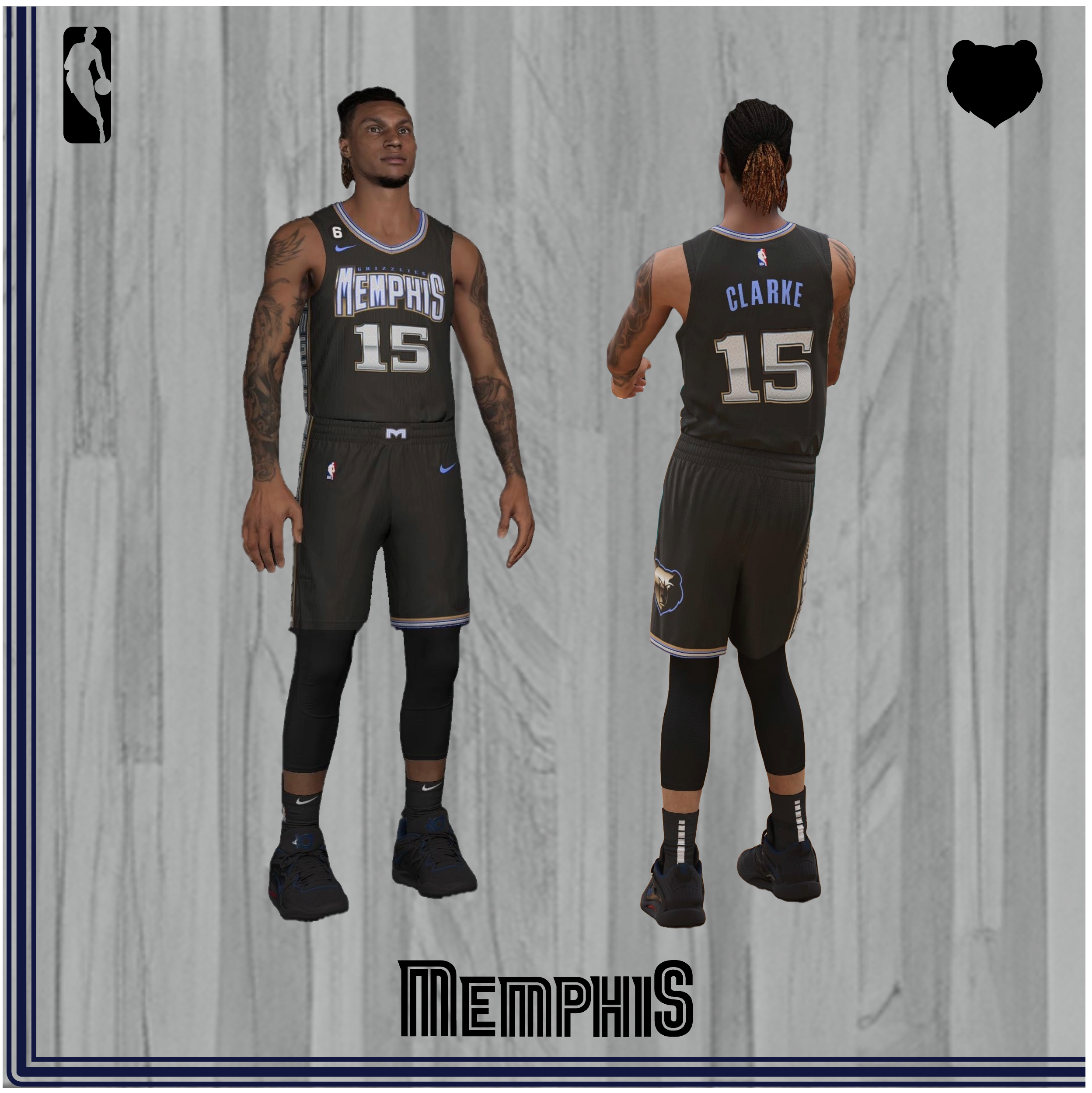
The creative team went off and all out with this getup, choosing to rely on their beloved design system and love of hometown music. The jersey features, like a number before, a hatchet-shaped wordmark, but this time, emphasizing the city of Memphis, with the keyword Grizzlies sitting above it. Another returning hallmark is the oversized bear on the left short leg trim, showing off a golden-imbued Griz with the BSB trim. And, of course, an asymmetrical panel on the right side, with an MG pattern calling back to the OG Vancouver jerseys with the Native Canadian style piping. The crux of the jersey’s personality lies in the diamond-textured letters and numbers for the Memphis wordmark, MG side pattern and the player numerics, each accented by chrome detailing, representing the box Chevys of the city’s hustling up-and-coming artists. The belt buckle ‘M’ is in the shape of the Hernando de Soto / “M-Bridge” with that same texture pattern. Most cutely, there’s a “For the ‘M’” tag above the jersey details on the lower left of the torso, with the ‘M’ sitting inside the golden teeth of the original Griz bear, something Ja and his grills would certainly appreciate. Every detail is beautiful, loud and screams Memphis.
I appreciate that these jerseys chose to play it bold, especially compared to the following year’s all-black City iteration. I love that this jersey makes aggressive design decisions while keeping up with the franchise patterns, and the BSB-chrome combo is unexpected but meshes nicely. Bonus points are awarded for no corporate logos to mess up the color scheme, since this was an in-between sponsor year.
#5 and #6 - Sounds ABA Throwback (2015-2016) and City Edition “Sounds” 50th Anniversary” (2024-2025)
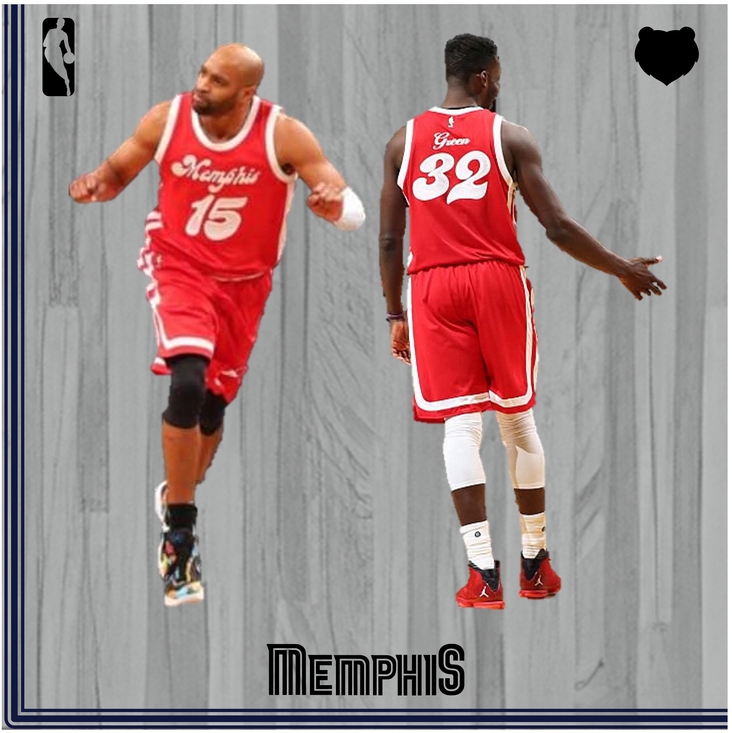
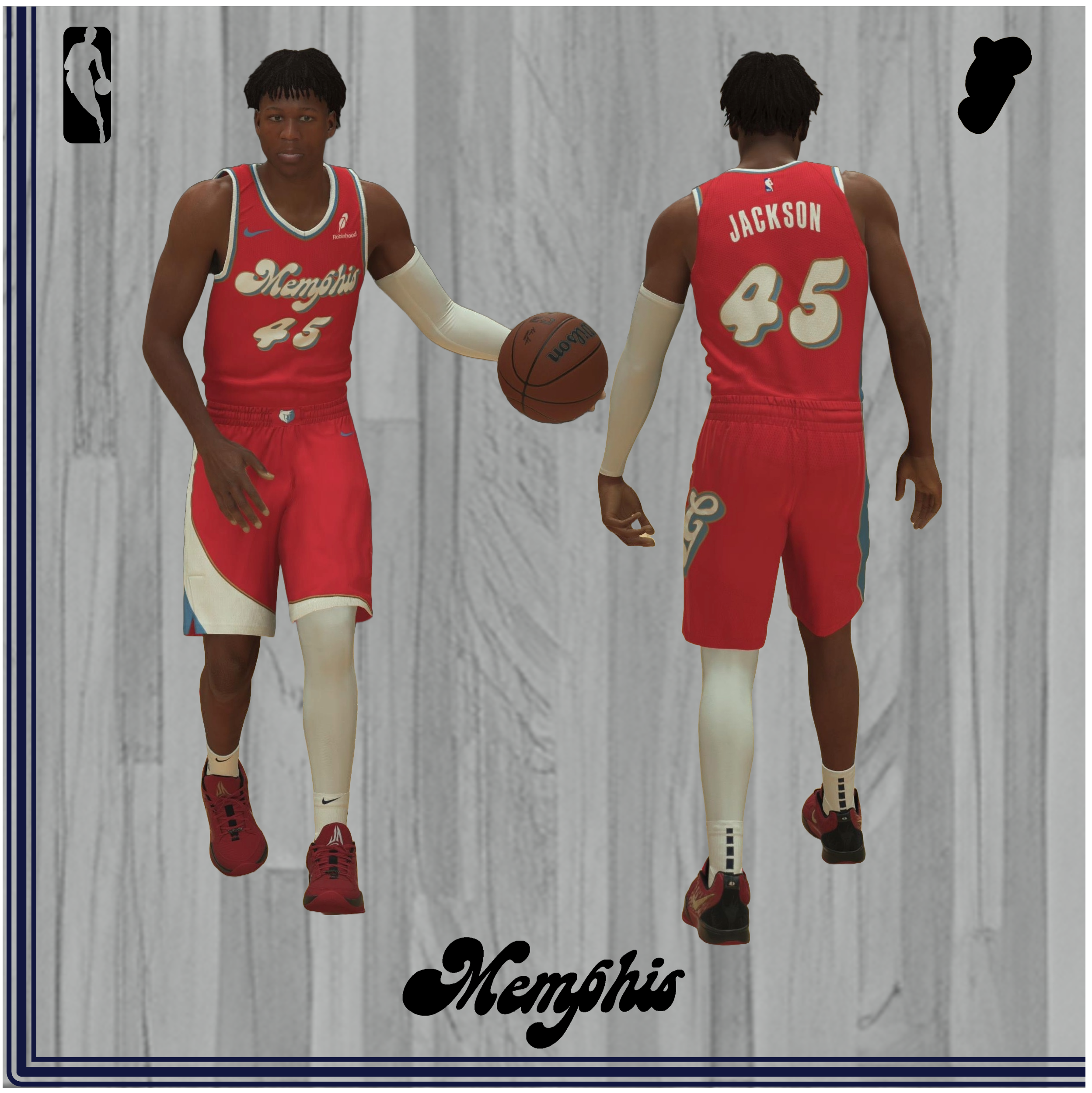
So it’s 1974 now, and there’s yet another rebrand in the ABA’s Bluff City, with the greatest jerseys and roster to date. Morale drops for the Memphis Tams, and Charles Finley begins cutting costs for amenities like game programs and in-arena experiences. The ABA takes corporate control over the club, and finds a new group to take ownership of the franchise. They find Memphis businessman Avron Fogelman, Holiday Inn’s Kemmons Wilson, and most importantly: Isaac Hayes and Al Wilson of Stax Records. In a stunning move, the commissioner of the league, Mike Storen, drops his position to move to Memphis and become a part of the ownership group. Storen came up with a classy logo, red and white colors, and relied on Memphis’ musical identity, with major credit to his fellow owners Wilson and Hayes. On the basketball side, the team got older with a complete roster overhaul (though they kept young Memphis native Larry Finch); this translated to team and fan success, with the Sounds making the playoffs and recording their highest attendance yet. In the first round of the postseason, they faced the eventual champions in the Kentucky Colonels, taking one game. But despite increased year-over-year success, professional basketball seemed to be over, with Wilson and Hayes having financial trouble, forcing Storen’s commish-successor Tedd Munchak to give a June 1st deadline to sell 4,000 tickets, get more investors, and get a better lease on the Mid-South Coliseum. This tall task could not be completed, leaving the Sounds back in league control. But this time, there’s no hometown hero to save them, and Baltimore businessmen step in to buy the team. This group quickly picks up troubles of their own, with two team names, three exhibitions, and one insurmountable financial situation in just a couple of months. The team folds, and with only seven teams remaining in the league, the ABA merges at season’s end with the NBA, with no Memphis team left to join the fray.
Simplicity is golden in this Sounds-era redesign. While other Griz jerseys make grand statements with intricate neck patterns and big claw logos, the beauty of this kit lies in the simplicity of a toned down classic design. The wordmark and number font play on the musical background of the city of blues, using rounded, bold letterforms with some eccentric swashes to drive home that Stax Records background. A simple, white two-lined stripe pattern adorns the sides, but my favorite feature is the surname on the back of the jersey. In an NBA first, the Sounds jersey uses script for the player names, with all non-first letters using lowercase lettering. This is a stylistically gorgeous touch, and gives these uniforms an extra touch of class that they rightfully deserve. Additionally, above the surname is an NBA sepia-toned logo present on many Hardwood Classics jerseys. No stone is left unturned with these jerseys, and it’s no surprise they’re now the only ABA jersey of our city’s history to be remixed for a 50th Anniversary Edition.
FF:The lowercase lettering system makes it basically impossible to properly implement in a video game like NBA 2K, as it would require completely separate programming String interpolation logic in order to merge lowercase and uppercase letters, not to mention the lexical nightmare of merging the letters in script together. Anyways, other teams to use lowercase letters for the last name on the back: the 2016 (football) Louisville Cardinals, 1987-1990 Washington Bullets, and the Sounds’ fellow ABA member, the Kentucky Colonels. It’s more common in old NHL jerseys and European football kits.
Following up with the 2024-2025 City Edition, the Grizzlies added some modern personality with a Beale Street Blue drop shadow and a ‘record gold’ outline to the wordmark and numbers. For the second straight year, that gold was added as connective tissue to their 2020-’21 City Edition “Memphis Soul,” which used the same color. As expected, an asymmetrical right side panel was added like most other post-2018 tops, with a blue and white pattern (plus a very thin gold trim) that cutely ends in a rounded pattern with the white on the shorts, reminiscent of the curves of a vinyl. The dichromatic, wordmark matching logo on the belt buckle is a nice touch, but the best feature of the jersey is the gorgeous G-Note, using the three aforementioned colors with a cursive, uppercase “G” then adding the notehead of a musical note to the bottom. While I love the additional details, major points are taken off because of the lack of script surnames on the back. It would have been cool to see an intercapped LaRavia, which we never got to see in 2015-‘16. Therefore, they are one spot lower on the list than the OGs.
FF: I mention LaRavia here because Ray McCallum didn’t join the injury-ridden ’16 until after the promotional jerseys ran, which would have been a pleasure to see. Also of note is that the Milwaukee Brewers Triple-A affiliate, the Nashville Sounds, continue to use some of the brand identity of the Memphis team until this day.
#4 Vancouver Home & Away (1995-2000)
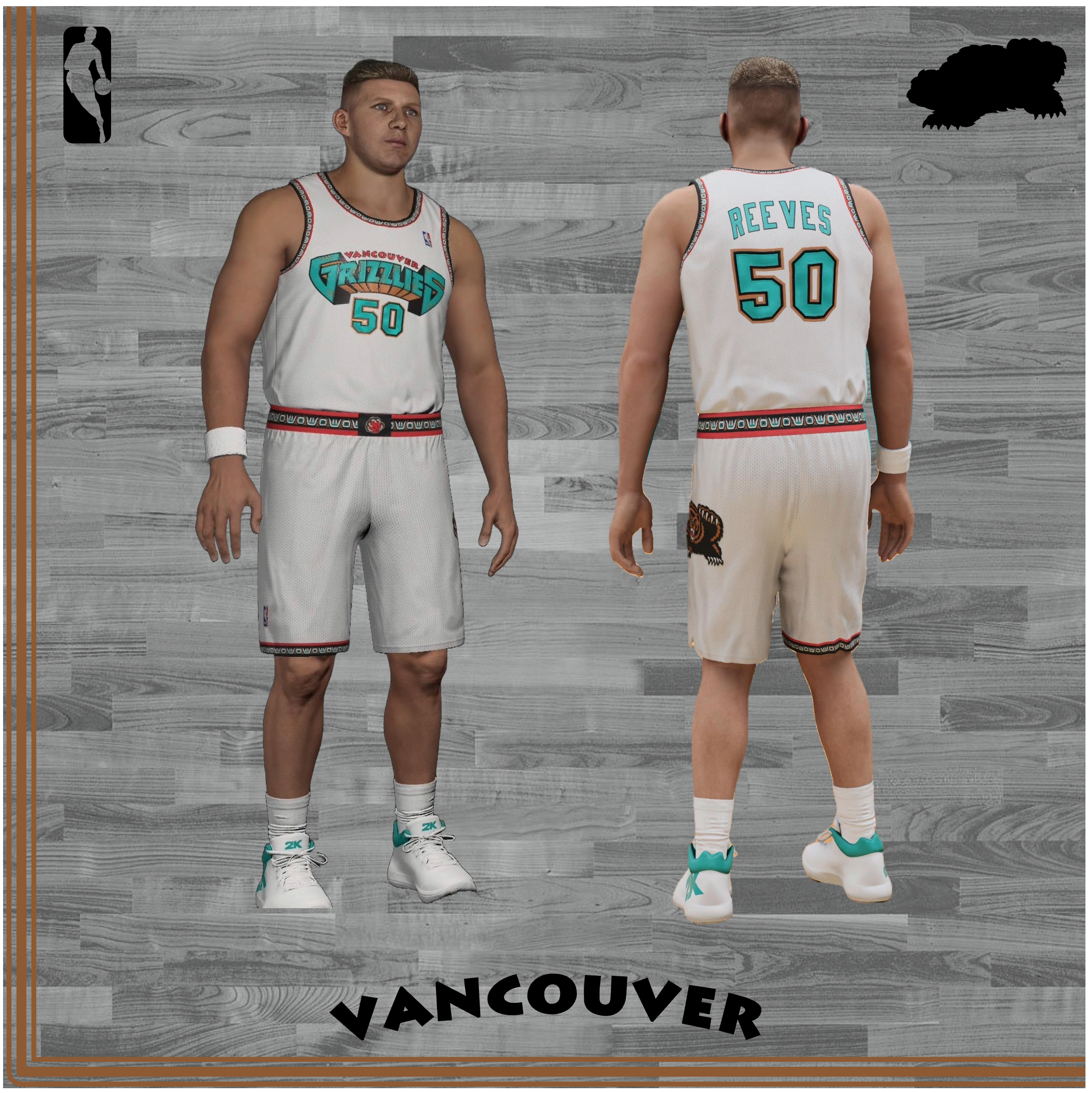
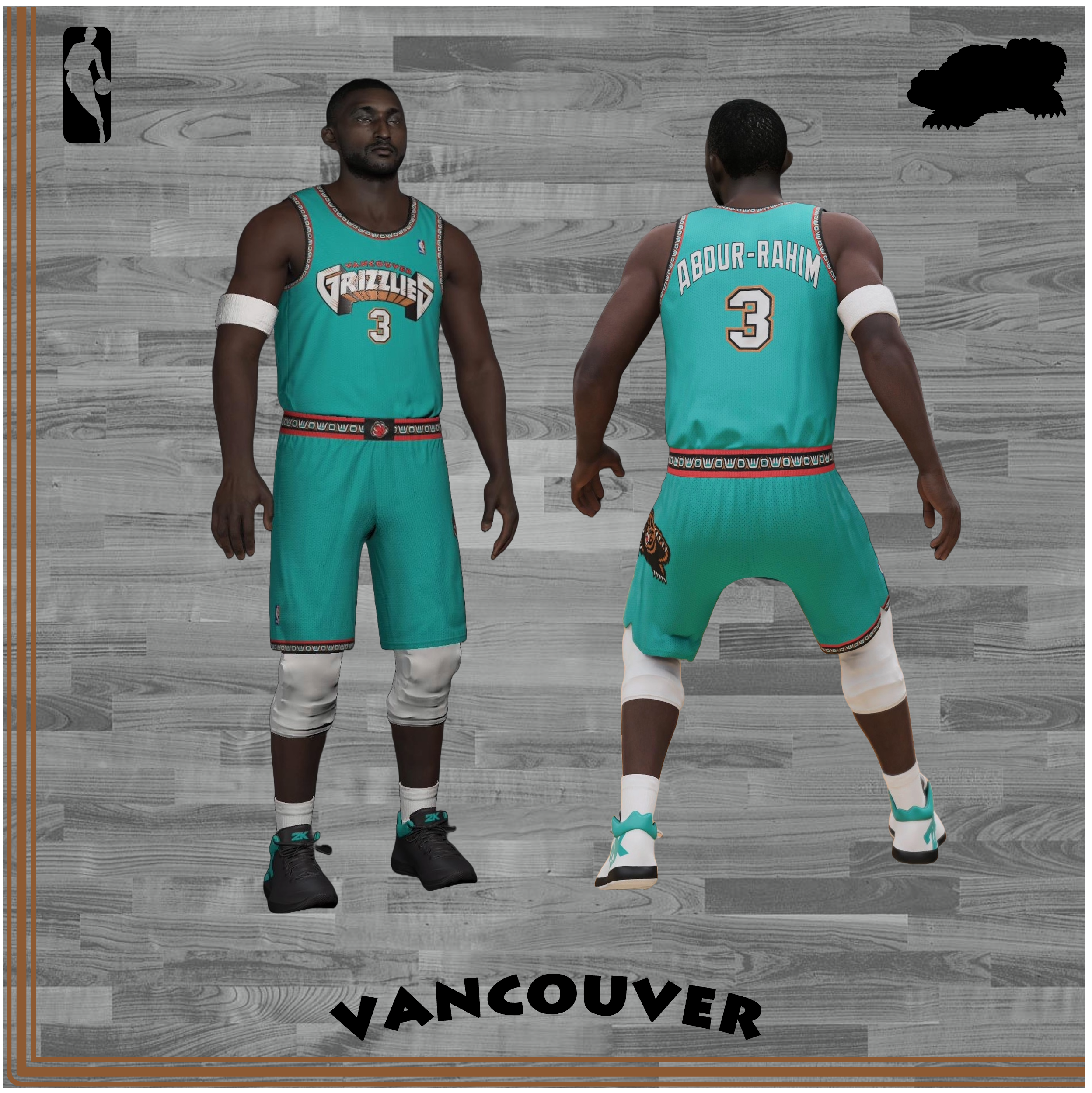
The jersey you’ve been waiting to see on this list – and probably think should be even higher, but where’s the fun in that? – finally arrives. By far the most elaborate jersey in franchise history, this kit is a perfect encapsulation of 1990s style, so it’s unsurprising that NBA fans, in their everlasting pursuit of ‘90s nostalgia, absolutely cherish these unis. These kits utilize the four original franchise colors: Pacific Turquoise, representing the ocean and waters around Vancouver; Bear Bronze, celebrating the native grizzly bears around the North Shore Mountains; Naismith Red, commemorating the Canadian founder of the sport (Naismith Silver makes the color list for the Toronto Raptors franchise as well); and black. The piping system, originally labeled the West Coast Trim, is one of the most memorable in sports history, with Native Canadian styled-lettering looping around the neck, shoulders, and right knee, surrounded by that Naismith Red and black. The beloved Vancouver Grizzlies wordmark rests on the chest, and the numbers have a light outline of Bear Bronze. Like many jerseys after it, there’s an oversized Griz bear on the left leg. And at belt center is the claw secondary logo where Naismith Red dominates.
These getups are a relic of 1990s jersey design, but boy are they wonderful. Though they were met with some criticism in the 90s and early 2000s, they have become one of the most appreciated jerseys in NBA history, so much so that young arrival Ja Morant campaigned in his rookie campaign to bring them back for classic nights; luckily, the Griz obliged. Though I love both of these jerseys, I find the logo on the home’s to mesh poorly with the white of the uniform base, and the oversized logo just feels like it’s out of nowhere when it’s tacked on with no solid background color. But I am glad that these are back this ‘24-’25 season with the throwback court on the ground below it. And speaking of the current throwback iterations, I actually really like the turquoise Nike logo on the right shoulder. These jerseys have been a favorite of mine since childhood, and I’m glad the national jersey fanbase switched up and catapulted this uniform to the top of the fandom list.
#3 City Edition “I Am a Man” (2017-2018)
 Source: Screenshots from NBA 2K20 / Custom Replica by Issy
Sometimes, simplicity is everything. The Grizzlies’ second MLK Day jersey, and first ever City Edition, skillfully commemorates the 50th Anniversary of Dr. King’s assassination with a uniform that pays homage to Martin Luther King and the Memphis sanitation workers’ strike in 1968. The wordmark is incredibly simple: the letters E through I in Memphis are underlined, akin to the underlining of the second word in the workers’ signs that read “I AM A MAN,” and the typeface of the jersey’s logotype and numbers matches the signs as well. Additionally, the wordmark’s internal separation of the first and last letters plays off the original logo’s “Grizzlies” wordmark. A large, sharp M appears on either side of the shorts trims, in negative white space surrounded by black, representing the city of Memphis and the Men that forced change in the workers’ strike. On the back of the jersey’s neck is a slight Beale Street Blue trim, as the Clayborn Temple off Beale Street and next to the FedExForum – now the site of the strikes’ commemoration with a monument of the aforementioned inscribed words – was the starting point for many in the strike, so BSB gets a feature. The logo on the belt buckle also features a drop shadow trim in BSB.
This jersey is simple, timeless, and the perfect encapsulation of a moment in time, which is why it ranks so high up on my list. There may not be an elegant side panel, a big bronze bear claw or an elaborate hodge-podge of colors, but it’s a unique uniform that speaks volumes in every stitch.
#2 City Edition “GRZNXTGEN” (2021-2022)
 Sources: Screenshots from NBA 2K22
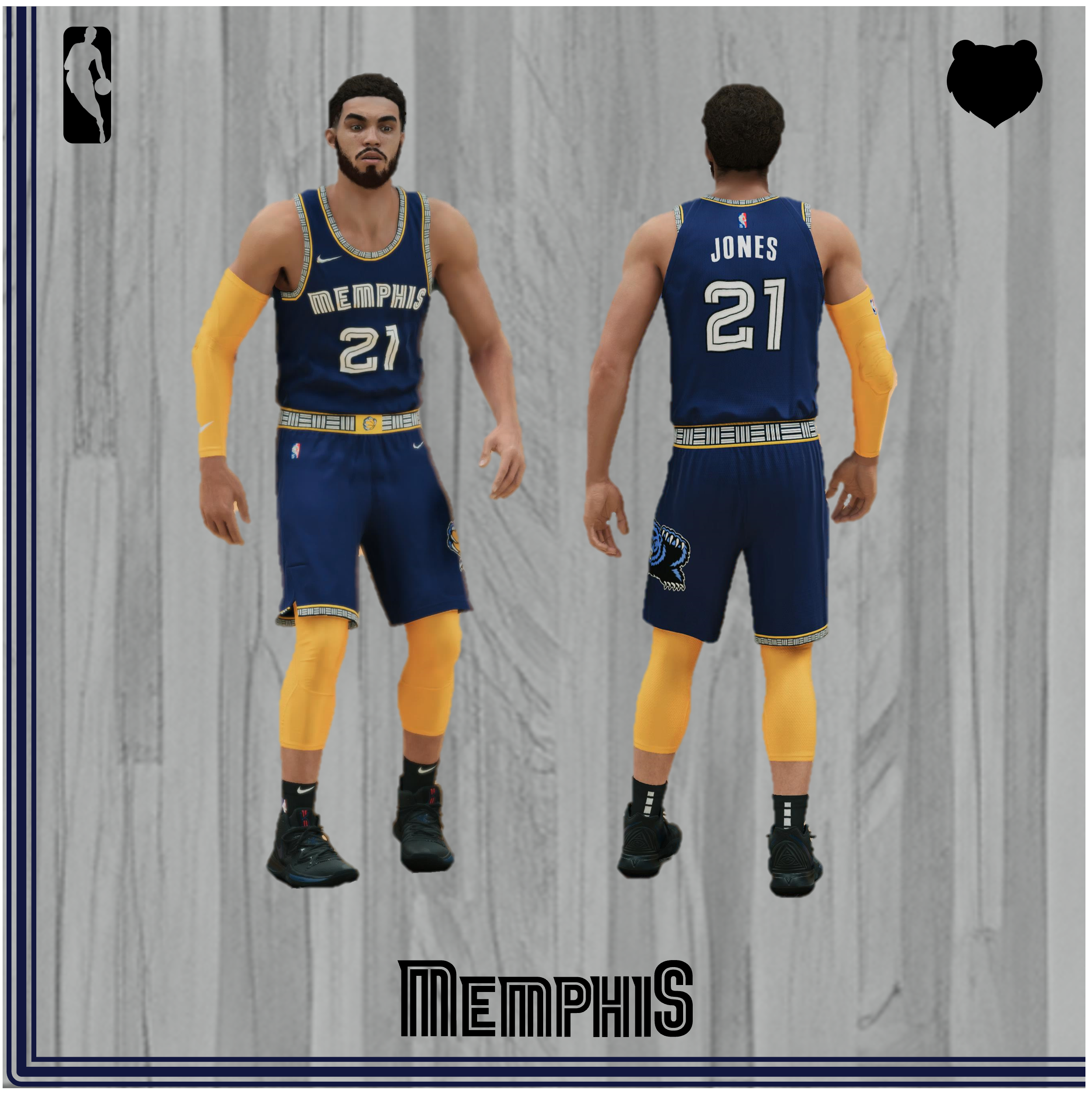
For the NBA’s 75th Anniversary, the second-youngest franchise in the league decided to outshine the whole crowd. The Griz chose Memphis Midnight Blue as their primary hue, but paired it expertly with Grizzlies Gold, with the trims of the neck, shoulders, right leg and belt all shining in that beloved bright yellow. The “MEM” container system occupies the piping role of the Native Canadian lettering from Vancouver’s first jersey, producing just the right amount of accessory detail. The Memphis wordmark on the chest is covered in bear scratches, and a BSB, GG and black oversized OG bear logo, my favorite franchise emblem yet, screams on the left leg (plus, there’s a bear claw on the belt center using that same gorgeous color combo). And there’s a diamond imbued Nike logo in the typical corporate spots, along with a shiny NBA 75 logo on the top of the back and right thigh.
This jersey has it all. A beautiful first color choice in MMB, striking GG trims, a perfect use of BSB in the alternate logos, clever use of bear-related traits, understated asymmetry callbacks (with a design format that’s basically the same as the original Vancouver kits), good league-wide jersey timing, extra time playoff encores beyond the originally scheduled 14 games (with some unbelievable, game-changing highlights associated with it). It’s a masterclass in jersey design, and there’s a reason it’s the consensus uniform pick for fans on the platform currently known as Twitter [sic]. I think it would be wise to use two alternatives of this jersey as the Icon and Association Editions in the next era of jerseys.
#1 Memphis Alternate (2009-2018)
 Source: Screenshots from NBA 2K23
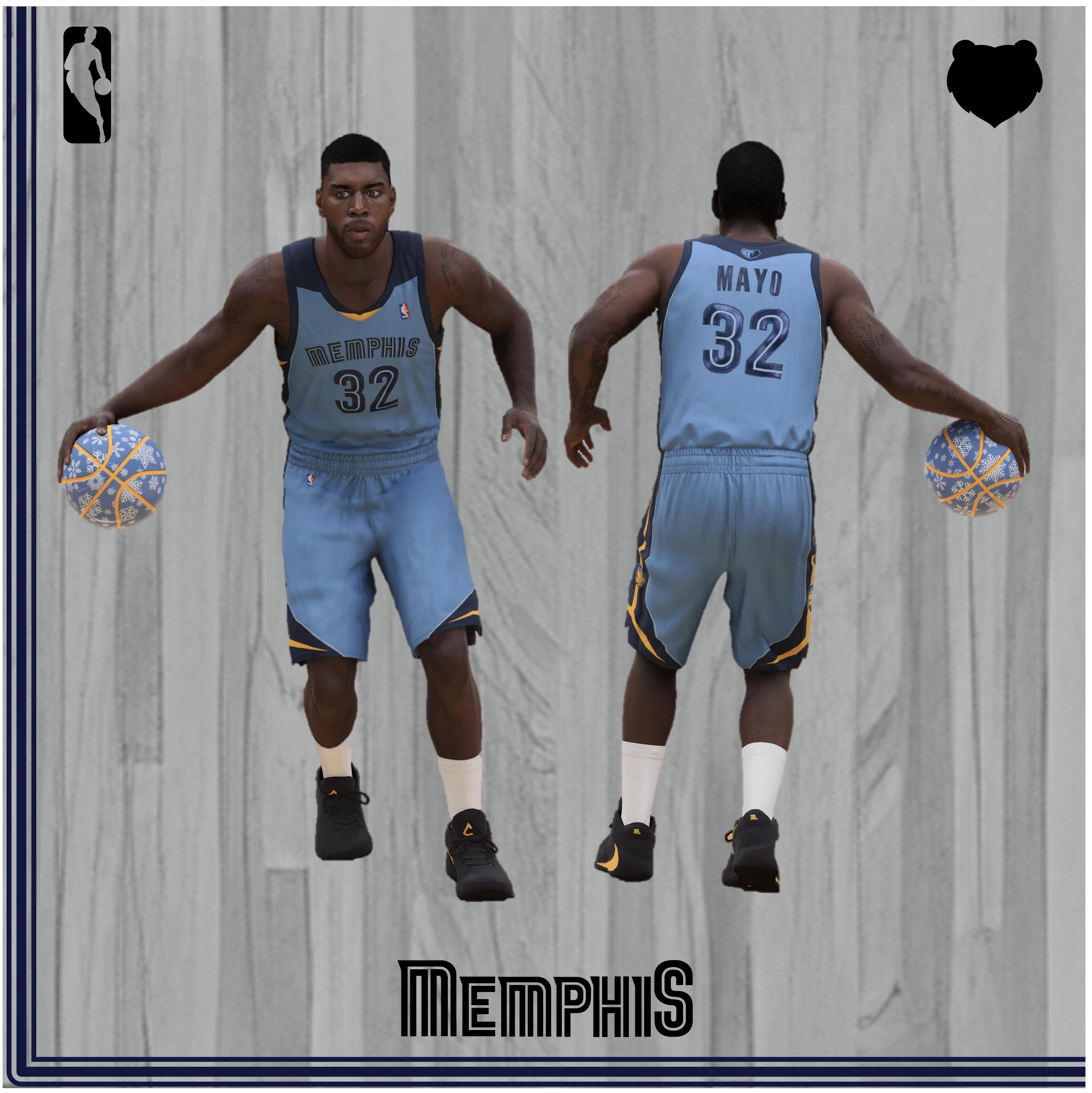
Every era deserves a defining look, and looks does this getup deliver. Debuting in 2009 with a neon shimmer that could’ve blinded television viewers, the baby blue alternates dropped onto the scene with a bang, as the Memphis Grizzlies looked to be a competitive basketball team with several newcomers joining the club: Zach Randolph from Los Angeles, Allen Iverson from free agency, and [redacted] from the draft (editor’s note: that draft, much like the 2008 NCAA Championship, never happened).. So along with a new look on the court came a jersey featuring that beautiful Beale Street Blue as the primary color, with a dash of Grizzlies Gold on the collar (minus the neck logo present on the home and aways) and acting as the secondary color on the laterals, along with Memphis Midnight Blue on the shoulder pads and playing primary on the sides. It also debuted the first non-arched wordmark, as MemphiS featured a supersized ‘M’ and ‘S’ on both ends. Also making its jersey debut was the Griz’ alternate bear claw logo, flanking the shorts on both sides on the vertical yellow lines.
To me, these jerseys symbolize the ultimate brand transformation of our beloved team. No longer were the Griz the young, untapped potential, playoff losing team, but they were instead the Grit ‘n Grind Memphis Grizzlies, with scrappy play and a team identity that could not be shaken, a team you didn’t want to see come into your house, and whose home you didn’t want to visit. Though the alternates dropped their neon-shimmer after one year after several class-action lawsuits (or so I was told), these jerseys had incredible staying power, as their spirit lives on in today’s not as great Statement Editions.
Fun Fact: Rudy Gay and OJ Mayo were credited with playing a role in the design process, which is pretty dandy. Additionally, these jerseys underwent two transformations: removing the shimmer and smoke blue number-inlay (still present in the wordmark) after 2010, and the switching of the gold collar to blue (like the city’s people), addition of a gold belt buckle with the primary logo, removal of the bear claw logos on the shorts, and downgrading of the side’s dual triple-pointed stars in favor of a simpler blue-gold-blue pattern in the Nike takeover of 2017.
